How to Use Mailchimp Popups in 9 Easy Steps: Grow + Convert!
Popups get a bad rap, thanks to some of the more annoying ones out there. But Mailchimp popups let you control the copy, timing and look. Click to learn more.
Updated November 6, 2024.
"Wait! Don't leave! Get 10% off on your first order!"
You've probably seen this message on at least one website before – maybe you even felt compelled to click on it.
The Mailchimp popup form builder is user-friendly and offers a generous amount of features, too. Used correctly, these popup forms can be a key element in your email marketing strategy that captures attention and leads, pops up at just the right time, and helps you feed into your branding.
How to create effective Mailchimp popups that turn website visitors into an email audience?
Here's your A to Z guide.
What is a popup sign-up form?
A popup sign-up form is a quick and easy way to capture subscribers for your list. Once installed on your website, a popup will appear to visitors according to-predetermined triggers, such as page visits, mouse movements, or time spent on the page.
Mailchimp popup forms are an efficient way to capture more email addresses – and the best of all is that building a Mailchimp form is extremely easy.
How to create a Mailchimp popup form
Here is a step-by-step process for setting up your own Mailchimp form.
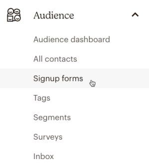
1. Click Audience, then select Signup forms.
- If you have multiple audiences, choose the desired one from the Current Audience drop-down.
2. Choose the Subscriber popup form.
3. Customize your popup form
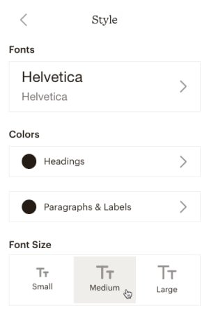
- Click on Style to customize fonts, font colors, and font size for your form.
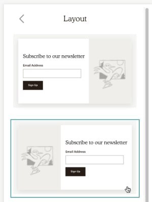
- Click on Layout to select one of the popup designs. All layouts will appear as a banner on mobile devices.
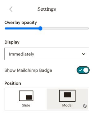
- Click on Settings to control the appearance of the pop-up form on your site.
- Overlay opacity: Adjust the slider to darken your website when the subscription form appears.
- Display: Choose the time delay before the popup appears.
- Show Mailchimp Badge: Toggle to add or remove the referral badge.
- Position: Select whether the popup slides from the bottom right or appears in the middle of the page.
4. Customize your form fields:
- If you want to add an image to your popup form, hover over the image placeholder in your layout and click Set Image.
- When you want to add a field to your form, click the plus (+) icon.
- If you want to edit a form field, just click and type.
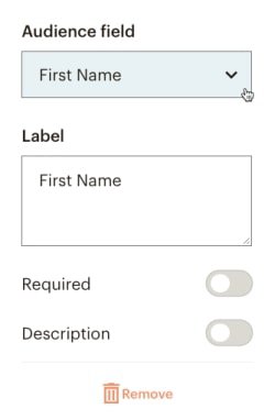
- If you need to change your Audience or Label, you can do so in the editing menu.
- Toggle on the Required slider to make a field mandatory.
- If you need to add Helper text for a field, toggle on the Description slider and add your text in the box that will appear on screen.
- Reorder form fields using the arrow icons.
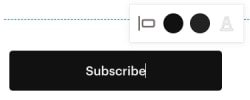
5. Click on the Subscribe button to customize the style:
- Highlight the button text to change it as needed. Use the style bar to adjust the button's Alignment, Button Color, Hover Color, and Font Color.
6. If you want to preview your form, click on the Preview button.
- If you want to check the form on different devices, switch between the mobile and desktop icons.
7. Publish or Unpublish Your Form
- If you have finished customizing your form, click Save & Publish to connect the pop-up form to your site.
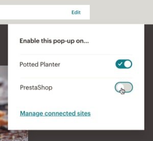
- To publish on multiple sites or disable the pop-up form on specific sites, click the Edit link, toggle the slider, and choose the desired sites.
8. Publish with Code
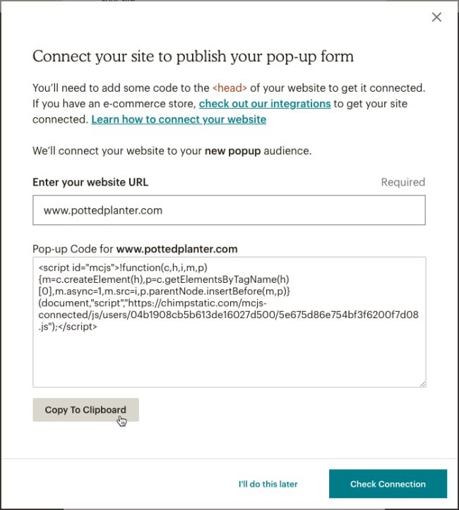
- If you haven't connected your site through Mailchimp's Integrations page, click Connect Site.
You also have the option to grab the popup code and paste it into your website's header:
- Follow the link to the integrations page and connect your site
- Enter your website URL, click Get Started, and generate a popup code snippet
- Paste this code between the <head> tags on your website
- Return to the pop-up form builder and publish
- Removing the code will remove the pop-up form from your site
9. Edit the Form
After adding the pop-up signup form to your site, follow these steps to make changes:
- Navigate to the pop-up form editor
- Click any design option to make your changes
- Click Save & Publish to update the popup form on your website automatically
Pro tip! Want to make sure your Mailchimp popup forms are perfect? Contact us and we’ll connect you with a Mailchimp expert for your industry in a matter of days!
Best practices for Mailchimp popup forms
There's more to creating a successful popup form than the technicalities – it's also about understanding your audience and knowing how to craft the best message that appeals to them.
Here are some best practices for creating effective popup forms:
Target visitors with personalized messages
Use demographic data such as location or user device type to customize the pop-up for each visitor. Doing this will increase the relevance of your message and make it more personal for each user.
Keep the design simple and in line with your brand
Make sure that your popup form is easy to read, with a clean and minimalistic design. This will help visitors find what they need quickly and without distraction.
Ensure, as well, your Mailchimp popup form design is aligned with your brand. Fortunately, Mailchimp's form builder allows for plenty of customization, so you can change a variety of elements in your popup form to make it look great on your website.
Keep the form short and concise
You may have a lot of questions, but your audience doesn't have a lot of time. That means you should keep the number of fields in your form to a minimum. Ideally, you don't want to add more than three fields on a form, but keeping it shorter than that is even better. You can request the user's name and email address only, for example.
Enable reCAPTCHA
reCAPTCHA is a security measure that helps protect your form from spammers and malicious bots. It's an easy way to deter unwanted submissions while ensuring genuine submissions get processed accurately.
Combine with SMS
Add a phone number field to collect phone numbers and send automatic SMS campaigns through Mailchimp. You can use them for personalized promotions or transactional texts across various touchpoints along the customer journey. You can also combine them with a Mailchimp drip campaign to boost engagement.
Stay clear and relevant
Be sure to keep your message clear and relevant. Avoid overloading the user with text or images, as this can be distracting and cause them to lose interest in signing up.
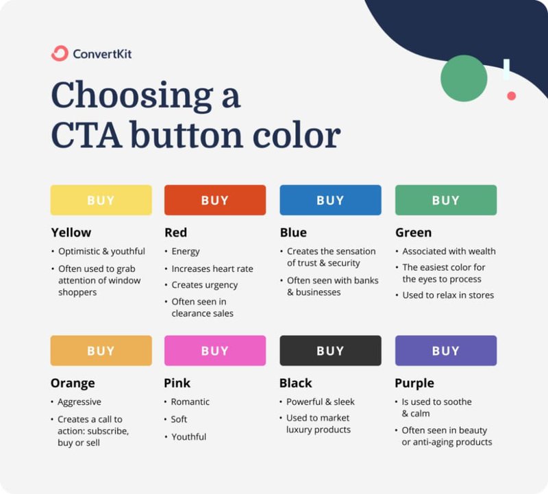
Include a call-to-action
Make sure you include an actionable call-to-action that is clear and compelling. Your copy should be succinct and direct, but also attention-grabbing.
Offer an incentive to sign up
Offering a special deal or discount is a great way to entice visitors to sign up for your list. People love freebies, so make sure you include something valuable to them in exchange for their email address.
Examples of incentives include:
- Discount coupons
- Free shipping coupons
- Product giveaway
- Freebie (e.g. a free eBook or report)
Choose between opt-in and double opt-in
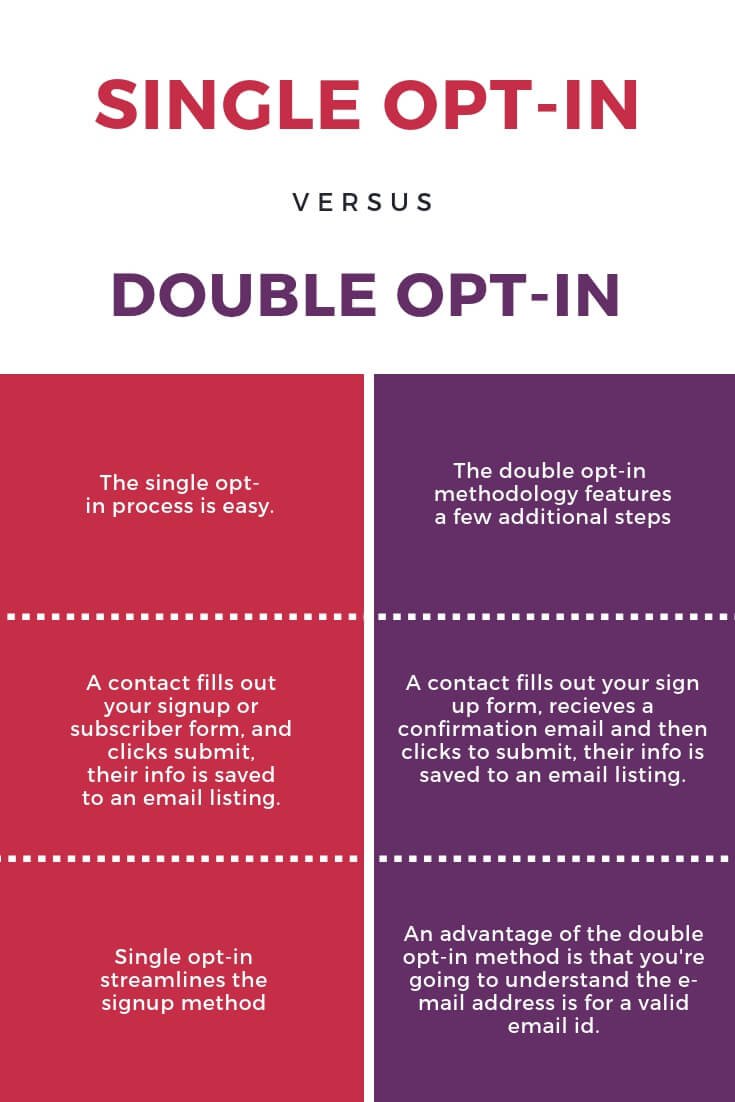
Picking the right type of opt-in can make a big difference when it comes to the success of your campaigns. With opt-in, users will be added to your list after clicking on the subscribe button, while a double opt-in involves sending them an email confirmation before joining. Take your goals and audience into account when choosing between these two options.
For instance, single opt-ins might be the way to go if you're looking to build a larger list. However, if your goal is to protect the quality of your list and ensure that people have opted in willingly, double-opt-in may be a better choice.
Make it mobile-friendly
Ensure that your popup form looks and works great on all devices, as this is essential for providing a good user experience. Since most people use their mobile phones to browse the web, optimize your pop-up for smaller screens so that it can be easily accessed and read by visitors.
Preview & test your form
Before publishing your form, make sure to preview it and test it out on different devices. This will help you identify any issues or errors that could prevent visitors from signing up successfully.
Describe the benefits of subscribing
Show your visitors why your list is worth signing up for, and what they will get out of it. Will they receive exclusive discounts? Regular updates on new products or services? Being clear about the value that subscribers will receive can help increase sign-ups.
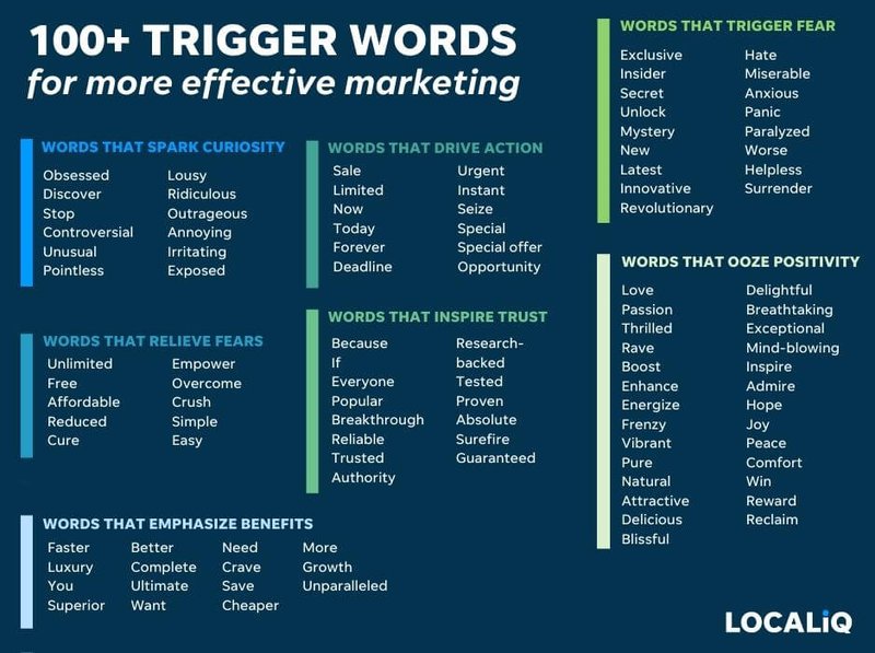
Use power words
Power words make people more likely to take action, as they usually tap into your audience's pain points, fears, and desires. Examples of power words include
- "Secret"
- "Guaranteed"
- "Proven"
- "Hurry"
- "Free"
Add a confirmation message
Confirming you got your audience's email address and that their reward is on its way makes people feel valued and appreciated. A confirmation message can also be an opportunity to add additional content and links, such as introducing more products they might be interested in purchasing.
Add a countdown timer
Adding a countdown timer on your form adds urgency to your offer, making your audience more likely to be afraid of missing out.
Make sure your audience knows exactly what steps to take when signing up for your Mailchimp newsletter. Include clear instructions and a link to any additional resources they may need, such as a privacy policy or terms & conditions page.
Use attractive visuals
Adding visuals to your popup form can help make it more attractive and inviting for subscribers. Visuals are also great for making complex messages easier to digest. Add images, GIFs, or even videos to your pop-up forms to capture the attention of visitors if that's aligned with your brand.
Choose the right popup trigger
When your popup appears on screen is just as important as how it looks. Mailchimp allows you to choose from a variety of popup triggers, such as:
- On landing
- On exit
- After a number of pages
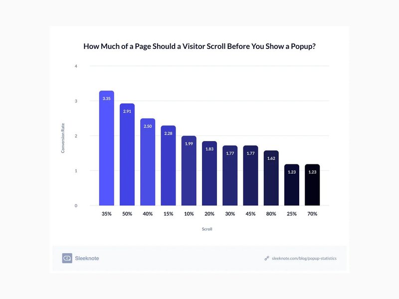
- On scroll
- On click
Which one you pick for your Mailchimp popup depends on your audience and goals. For example, if you want to encourage people to subscribe before leaving your page, an exit-intent popup is probably the best option.
However, if you'd like for people to "know" you a bit more before you extend an invitation for your email list, you might want to trigger the popup to appear after a certain number of pages.
Define your audience segments
Defining different audience segments you want to target with your business is important for a number of reasons – most of which pertain to designing personalized experiences and improving conversion rates.
The same stands true for subscriber pop-ups too. When you have well-defined audience segments, you can design popup campaigns that speak to people. Some of the criteria you could use for defining these segments include your audience's
- Interests
- Country
- Language
- Gender
- Relationship with your company (e.g. are they new or returning customers?)
Target your popup form to different segments
Now that you have your segments ready, you can create separate popup forms for each one. This will allow you to target your audience in a more personalized way and even offer exclusive deals or benefits to different sets of people.
For example, if you have an international audience, consider creating different pop-up forms that cater specifically to customers from different countries. This will help them feel like they are being acknowledged and appreciated.
Here are some popup segmentations you could use:
- New vs returning visitors
- Website pages
- Geolocation
- Device used
Include all new sign-ups in a drip welcome sequence
Including all new subscribers in a drip welcome sequence can be an effective way to nurture leads, increase engagement, promote your business, and make it more likely people want to stay in your email list.
And the best part of it is that Mailchimp is one of the best email marketing tools on the market, so connecting your popups and your email strategy is easier than ever.
A well-crafted welcome email flow should introduce your brand to new subscribers, provide them with valuable content, and encourage them to take action. For example, your popup campaign could include an automated email with a discount code as an incentive.
Likewise, you could design different welcome email marketing campaigns for each target audience according to your popup campaign segmentation.
This way, someone who is a recurring visitor on your website would receive a different email sequence than someone who, say, was a first-time buyer. Or someone who is from France could receive a different series of emails than someone from the United States.
If you want to create different welcome email campaigns, remember to first delete the default welcome email Mailchimp has pre-set for you.
The more you segment your audience (and work with your segments), the more custom and personal your entire messaging will be. Not only will this pay off in terms of branding and relationship building, but it will increase your click-through and conversion rates, and it stands a very good chance to boost your customer lifetime value too. Check out our guide to learn about Mailchimp's CRM features.
Don’t have enough time to dedicate to building a conversion-oriented, effective email strategy based on personalized emails? Hire an email marketing consultant vetted by Mayple and get the ball rolling in a matter of days!
Mailchimp pop-ups: an invitation for further discussions
People say they dislike popups – but what they really dislike is the dishonest, disruptive, or intrusive ones.
If your popup is honest, relevant, and helpful, with an invitation to build a relationship (not an email list!), it could be just the thing to get people to join your email list and become paying customers.
Mailchimp's popup campaigns are one of the most popular ways to invite people into a conversation. With plenty of options(like setting triggers, custom designs, and targeting options available, it's easy to create an engaging and effective popup.
FAQs
How do I add a pop-up in Mailchimp?
To add a pop-up in Mailchimp, go to the Signup Forms page in the Audience section, click Create and select Pop-up Form. From there, you can design your popup by adding elements like text blocks, images, videos, and HTML code.
Does Mailchimp have a pop-up?
Yes, Mailchimp has an integrated pop-up feature that allows you to create fully customizable pop-up forms that appear on any page of your website (whether you're using Mailchimp's website builder or any other platform). You can design the pop-up, set the display triggers, and even add custom HTML code to make it unique.
Can you add a pop-up to Mailchimp landing page?
Yes, you can add a pop-up to a Mailchimp landing page. To do it, create the pop-up form and then embed it on the page you want. Remember you will have to connect the website to Mailchimp before you can embed the pop-up form on any page (otherwise, you will have to copy and paste the code in the header in your page's code.)
How do I create a pop-up email?
If you want to create a pop-up email subscribe form, be sure to personalize the form as much as you can. Also, offer a lead magnet, include relevant images and attractive graphics, choose the right trigger, and make sure your form copy is clear and compelling. Last, but not least, use the right targeting rules to make sure your message feels personal.
