10 Examples of the Best Browse Abandonment Emails | Expert Guide
What's more challenging than driving traffic to your site? Getting visitors to complete orders. See this guide + expert examples for browse abandonment emails.
Updated November 5, 2024.
Ever visited an online store, browsed through various products, then closed the tab without buying anything?
Who hasn't, right?
Online window shoppers are great because they are proof that your top-of-funnel marketing works. But if you run an eCommerce, you know what all this browsing around means for your business: lost opportunity.
But there is hope. If visitors browsed through your entire shoe section or spent 20 minutes looking at your handmade bowties, they must have a good level of purchase intent, right? So there's plenty you can do. Like, for example, sending them a browse abandonment email.
Done right, these browse abandonment reminders are like a pull lever – helping you draw people back into your store (and closer to the checkout).
How to create browse abandonment campaigns that do more than just nudge people but help you build a stronger brand and attract loyal customers?
Read on to find out.
What is a browse abandonment email?
Browse abandonment emails are automated messages you can send to email subscribers who looked at your products but didn't add any items to their shopping carts. This type of email can allow you to convert known contacts to complete a purchase.
Most browse abandonment emails will include images and information about the browsed products, associated with compelling copy that highlights the benefits of these products. By reminding customers about the products they've been looking at, you can increase conversion rates and boost your business' revenue.
Browse abandonment vs. cart abandonment vs. product abandonment
Browse abandonment, cart abandonment, and product abandonment all involve potential customers leaving your website without making a purchase. However, there are important distinctions between them:
Browse abandonment
Browse abandonment occurs when a user leaves your website without adding items to their cart or initiating the buying process. The purpose of a browser abandonment email is to remind the user of the products they viewed and encourage them to return.
Cart abandonment
Cart abandonment happens when a user adds items to their shopping cart but leaves the website before completing the purchase. Cart abandonment emails focus on recovering abandoned carts by reminding users of their selected items and potentially offering incentives to complete the purchase.
Product abandonment
In email marketing, product abandonment is a very targeted version of abandonment. Instead of triggering reminder emails when someone looks around your website, it triggers them when someone looks at a specific page or product. Sometimes, product abandonment will overlap with category abandonment too. For example, you can send targeted messaging to customers based on a category they looked through, rather than specific products.
Tips for creating killer browse abandonment campaigns
Successful browse abandonment emails are more than just a quick reminder; they should be built on solid, privacy-friendly data collection practices. Here are some of the best practices to ensure your browse abandonment strategy is effective, customer-centric, and compliant:
Capture email addresses early
Prompt visitors to provide their email addresses early in the browsing process so that you can add them to your email lists and have a means of contacting them later. Remember that most people are unwilling to share their email addresses without getting anything in return, so you must incentivize them. Some ways to do this include offering
- a voucher or discount
- entry to a contest or giveaway
- personalized advice and relevant content
- a free product, or
- exclusive content.
Use compelling visuals
Include high-quality product images in your emails to remind users what caught their attention. These images should tap into their initial want or desire, so they need to be more than just simple product photos. Ensure the products are put in a context that encourages people to return to your website and complete the purchase.
Craft persuasive copy
Write persuasive and engaging copy highlighting the benefits, features, and unique selling points of the targeted products. Here are a few tips for writing effective copy:
- Keep it short and sweet – there's no need to oversell or write an entire thesis paper on why someone should buy your product.
- Always keep the customer at the center of your copy – think about them and what they really want, whether that's a new outfit, the chance to look better, or feel healthier.
- Make it cohesive with your brand – you want this email to feed into your email marketing strategy and brand, not become just another transactional message in an inbox.
Segment your audience
Good audience segmentation allows you to go into the nitty-gritty and craft effective browse abandonment emails that speak to people. For instance, you could segment your audience based on whether they're first-time shoppers or return customers.
Or, if you're going for the "product abandonment" option, you could segment your audience according to product categories, and create relevant email copy and designs.
In other words, audience segmentation allows you to create emails that build on conversation, instead of blasting off messages that feel like a monologue.
Leverage personalization
Tailor your emails to the user's browsing behavior and preferences, using dynamic content to create a personalized experience. Audience segmentation plays a huge role in this, but remember that you need to personalize your emails to each segment to avoid leaving money on the table.
Here are some email personalization methods you can try:
- Use personal pronouns like "you" and "your" in your email copy
- Include the customer's name in the subject line
- Add product recommendations matched with each customer's browsing behavior
Create a sense of urgency
Time is a resource we rarely have enough of – it's limited, cannot be bought, and is constantly ticking away. Leveraging the concept of time scarcity can help you create a sense of urgency and encourage customers to return and complete their purchases. Be sure to
- Include countdown timers next to products in the email
- Offer limited-time discounts and promotions
- Remind shoppers that stock may run out soon
Optimize for mobile
Studies show that 81% of emails are opened and read on mobile devices. You simply cannot ignore mobile optimization for your marketing emails because your browse abandoner is very likely seeing them on a smartphone or tablet. Here are some mobile optimization tips we recommend:
- Create responsive design templates for emails that render perfectly on any device, from mobile to desktop
- Shorten your copy and opt for clear headlines and concise body copy
- Optimize images for the right size, resolution, and format
- Keep CTAs in viewable areas of a mobile screen – they should be visible without having to scroll down too much
Test and iterate
There's no finite, irrevocable, or "one size fits all" solution for email marketing. You need to test, iterate, and adjust continuously. Remember only to test one element of your email at a time: whether it's your subject lines, heading, body, incentives, CTA, etc. This allows you to draw actionable insights from your tests and track the performance of each element.
The perfect structure of a browse abandonment flow
A well-structured browse abandonment flow is essential for your email marketing success. Consider the following key components when designing your flow:
Initial email
Send the first email shortly after the user's browsing session. Remind them of the products they viewed and provide a strong call-to-action.
Follow-up emails
Depending on your audience's behavior, you can schedule additional promotional emails over the next few days to maintain engagement. These can include personalized product recommendations or limited-time offers.
Final email
If the user has yet to convert after a series of follow-up emails, send a final email with a compelling incentive to encourage them to take action before it's too late.
Browse abandonment email subject lines to inspire
We get more than 120 business emails every day. We need more time to go through all of them!
Crafting subject lines that make people stop scrolling is crucial to the success of your email campaigns – so, no matter the goal of your emails for shoppers, you need to make sure your subject line is succinct, enticing, and actionable.
Here are 30 examples of catchy browser abandonment subject lines you could adapt to your business:
- "Did you forget something?"
- "We saved your cart for you!"
- "Your wishlist misses you!"
- "Hurry back – limited stock on your favorites"
- "Don't let them slip away"
- "Rekindle your shopping spree"
- "Here's something you'll love"
- "Unlock exclusive deals for your browsed items"
- "Just for you: special discounts on your favorites"
- "Ready to pick up where you left off?"
- "Complete your purchase and enjoy free shipping"
- "Come back for a surprise discount!"
- "Last chance to grab your favorites"
- "Discover what you missed out on"
- "Your unfinished shopping awaits"
- "Exclusive offers for your browsing history"
- "Find your perfect match today"
- "Don't let your wish list gather dust"
- "Your cart called, it wants to be fulfilled"
- "Limited time: special offers on your interests"
- "We can't let you forget these deals"
- "Your dream items are waiting for you"
- "Get back to shopping and save big"
- "Don't let your shopping journey end yet"
- "It's not too late to get what you want"
- "Your favorite items need you"
- "Your shopping bag deserves some attention"
- "Remember the items you loved? They miss you"
- "Come back and explore new arrivals"
- "We've extended an offer just for you"
10 examples of the best browse abandonment emails
Not sure where to start with your browse abandonment emails? Here are ten examples of effective emails to successfully re-engage potential customers.
On – ☁️ Still available?
Why we like it:
- Showcases products from the shoppers' browsing history plus additional popular products
- States the delivery option
- Simple and high-quality images in the email body
Cole Haan – Open to see the styles curated for you
Why we like it:
- “Bag this one before it’s gone” emphasizes it's a limited product
- Simple email without fancy design or copy
- Provides other product recommendations in case the original product isn’t suitable
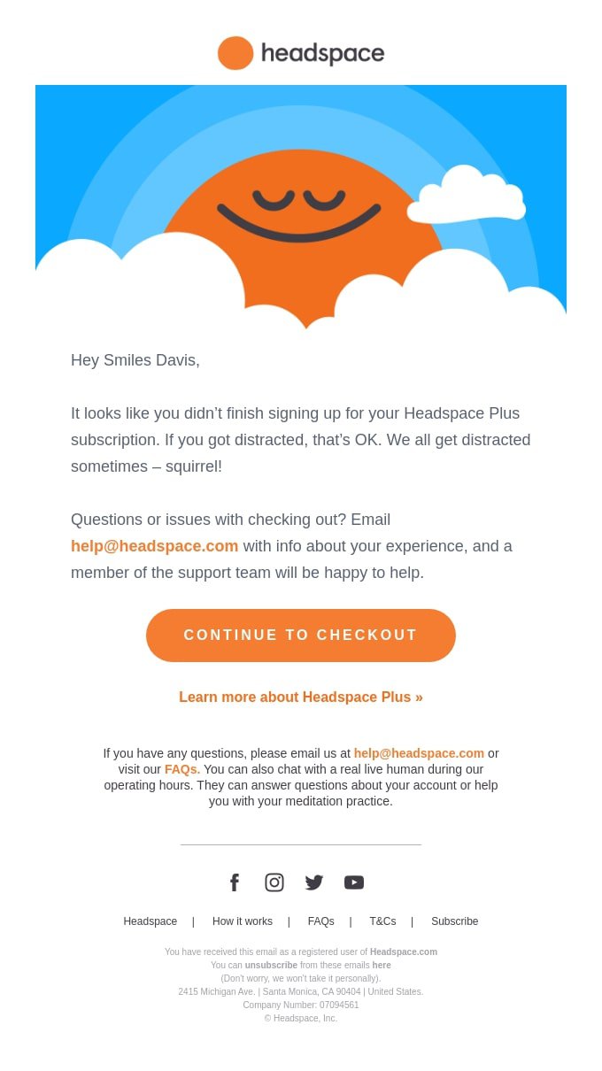
Headspace – Quick heads up
Why we like it:
- A clear CTA nudging a leading the customer to checkout
- Reminds the customer of their initial purchase intent
- Copy is relatable and creates a sense of trust
- Offers an email for help if needed
Alex Mill – Get Them for 15% Off!
Why we like it:
- A friendly and casual tone in the copy
- “15% off” written in the subject line and email
- Visuals of other abandoned items
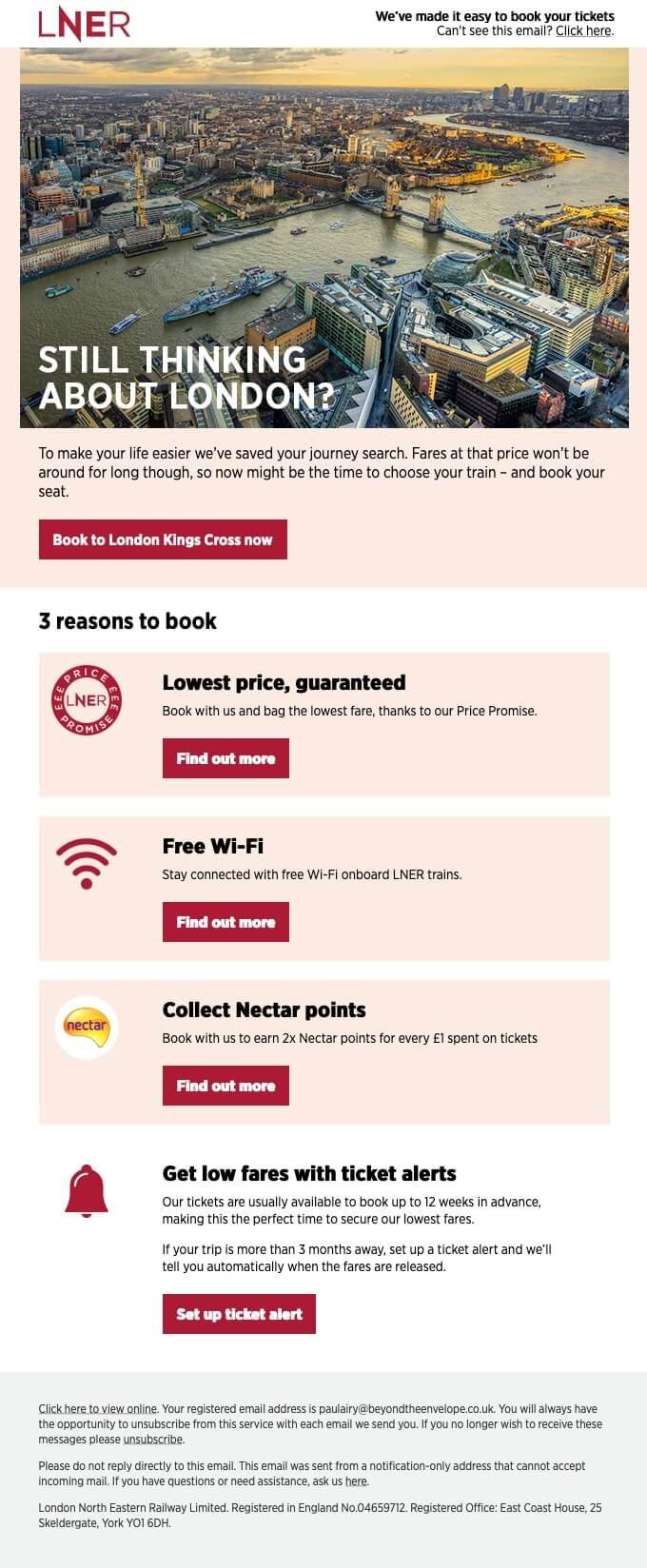
London North Easter Railway – Smiles Davis, the journey to London Kings Cross won't be the same without you
Why we like it:
- Refers to the product in the subject line
- Prominent CTA
- Highlights benefits of purchasing with LNER
- True to the brand's colors and visual style
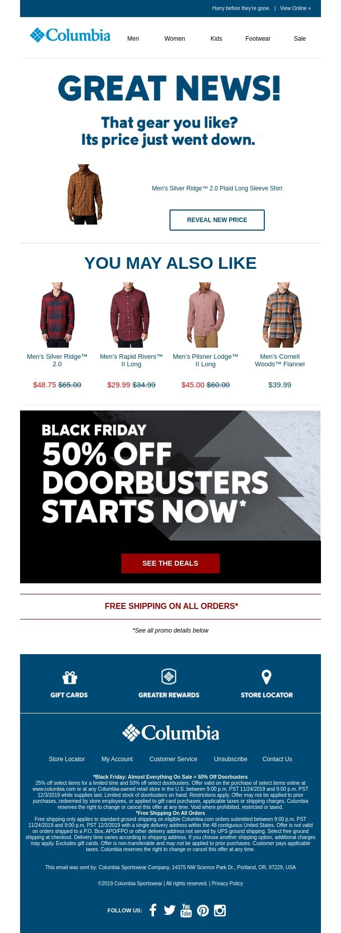
Columbia – Price drop on your favorites!
Why we like it:
- Includes a CTA to see the reduced price
- “You may also like” provides a personal feel
- Offers a Black Friday promotional discount
- Straightforward and relevant messaging
Pulp&Press – We noticed you checking us out… 👀
Why we like it:
- The subject line is an effective hook
- It offers an incentive (the rewards)
- It provides other product recommendations
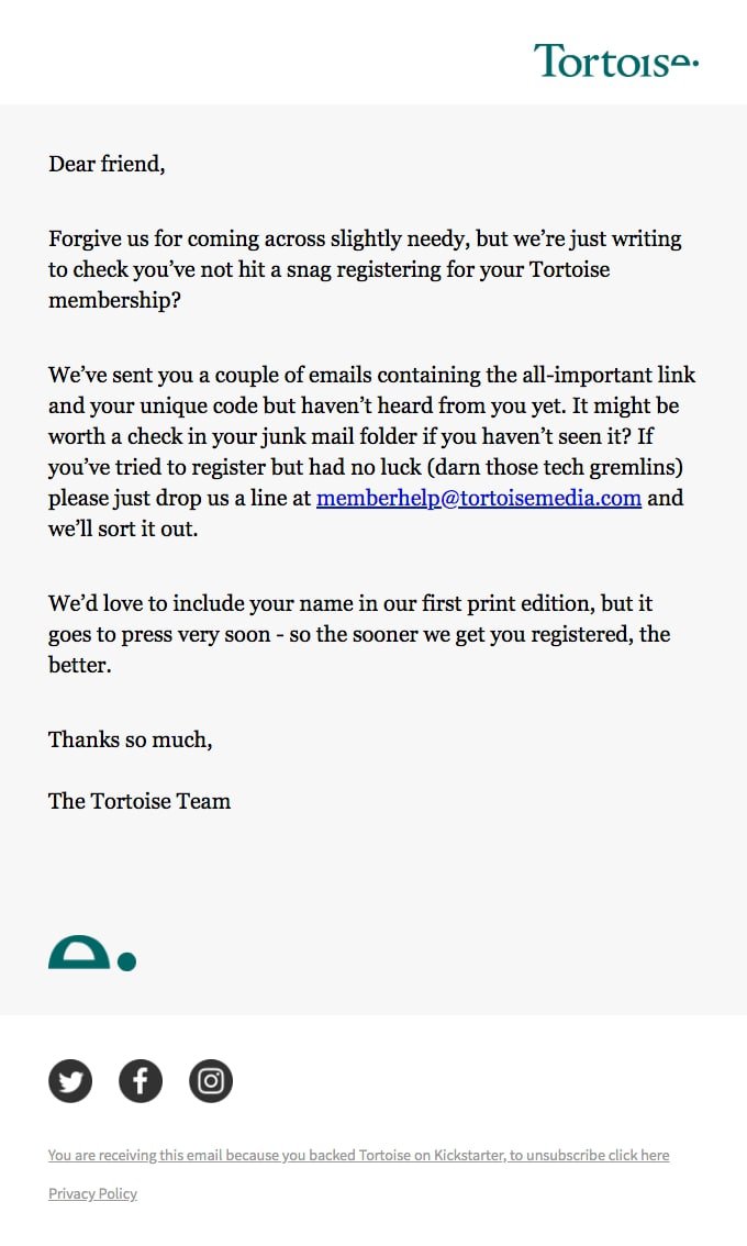
Tortoise – A reminder to register for your Tortoise membership
Why we like it:
- The subject line is clear and to the point
- The email design and tone of voice are simple yet effective
- It taps into the fear of missing out by mentioning the inclusion in the first edition
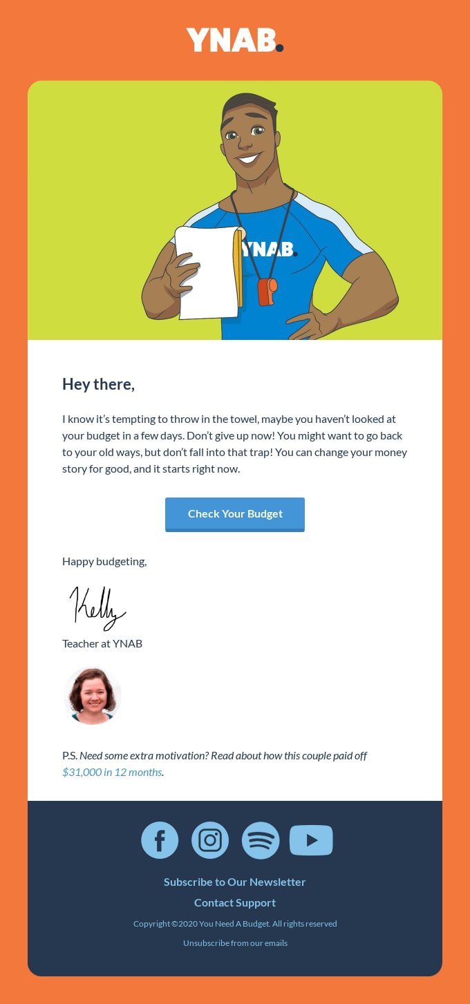
YNAB – Where’d ya go?
Why we like it:
- The subject line is engaging and feels very personal (even without name tags!)
- The body approaches the pain point from the get-go
- The email includes social proof, mentioning a successful case study
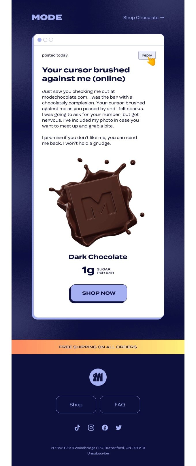
MODE – Missed connection?
Why we like it:
- The subject line is charming and actionable
- The heading uses humor in a tasteful way (pun intended!)
- The email body has a unique tone of voice perfectly aligned with the selling proposition
Browse abandonment emails: Turn window shoppers into loyal customers
In brick-and-mortar stores, window shoppers are incentivized to make a purchase with discounts, fragrances, lights, banners, and good salespeople.
As an online store owner, you can't stand next to your customer and tell them the color of the shirt they picked out looks great on them. What you can do is add pop-ups to your site and collect data to stay in touch with your potential customers. Browse abandonment emails help you do just that: reconnect with consumers who have a solid level of intent, remind them of you, and invite them back into your store.
The key is making sure your message isn't invasive, but exciting – and that all the data you collect about consumers (and consumer buying intent) is compliant, clean, and well-segmented. When you master these two basic principles, browse abandonment emails can do more than just bring people back into your eShop; they can build brand, loyalty, increase revenue, and turn first-time buyers into repeat customers.
So – are you in?
FAQs
How do you write a good browse abandonment email subject line?
Crafting a good browse abandonment email subject line involves being concise, using personalization or urgency, and creating intrigue to encourage recipients to open the email. Test different subject lines to see what resonates best with your audience.
How many emails should be in a browse abandonment flow?
As a general rule, most email marketing experts suggest you should include three browse abandonment emails for shoppers and potentially one SMS. Keep in mind your copy should be short, snappy, and enticing – just enough to motivate people to return to the site and make a purchase.
When should I send a browse abandonment email?
You should send a browse abandon email when an online shopper in your email list looks at your website, product, or product category, but doesn't add an item to their shopping cart. Browse abandonment messages are sent via email (and sometimes SMS) soon after the user has visited your website. Also, browse abandonment emails are not to be mistaken with cart abandonment emails, sent when someone adds items to their cart but doesn't complete the purchase.
What is a browse abandonment flow?
A browse abandonment flow is an email series sent over a period of time to shoppers who viewed a page, category of products, or specific product on your website, but did not add it to their shopping carts. The purpose of these product abandonment messages is to get browse abandoners to make a purchase. A typical browse abandonment email usually includes three emails: a quick reminder (sent within hours after the abandonment), a nudge, and a final offer.
How do abandoned browse emails work?
Browse abandonment emails are automated messages you send to your email list when they've viewed products or pages on your site, but didn't place an item in their shopping cart. Sending such emails or SMS marketing messages takes the opportunity back into the store and can increase the conversion rate and revenue by reminding shoppers about your products or services.


