7 Pro Tips to Creating Stunning Google Ads Landing Pages
Your ads aren't converting well enough? Want to know how to improve your landing pages? Here's a comprehensive guide on improving your Google Ads landing pages.
Published November 5, 2024.
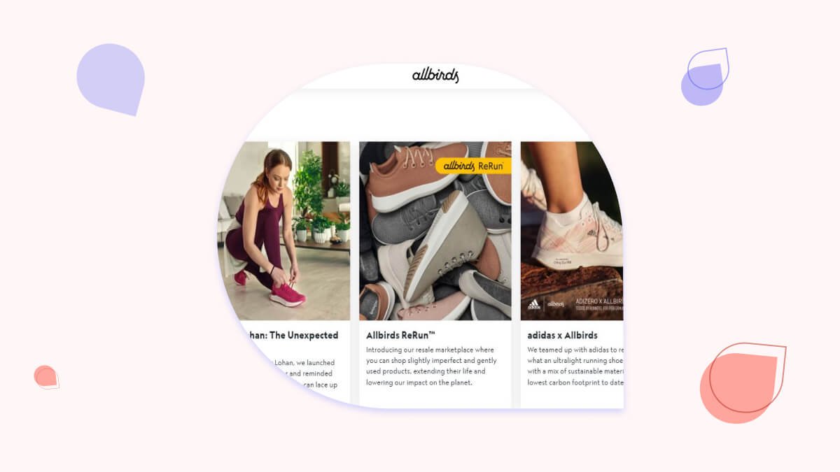
You've heard of landing pages. You may even have built a few in your day. But if you want them to be effective, there are some basics you need to know about crafting them for Google Ads.
Your landing page can make the biggest difference to the return on investment for any campaign.
In order of priority for the most impact, here are the essentials for your next launch and a few nice-to-haves to move the needle.
What is a Google Ads landing page?
Landing pages are critical to any successful Google Ads campaign. After a visitor clicks on an ad, they land on the landing page. This is where you have the opportunity to convert them into customers, so it's important that you use these pages wisely.
A good landing page should include a clear call-to-action (CTA), content that matches the ad and the user intent (and their specific search query), and some high-quality images and videos.
What's the purpose of having a dedicated landing page for each ad?
Dedicated landing pages are a great way to get the most out of your ad spend. When someone clicks on one of your ads, they're taken directly to a page with the sole purpose of convincing them to take action and make a purchase.
They're free from distractions and help you create a better user experience for these users by providing them with more information about your company and your products and services.
I'm going to cover the basic tips first and then we're going to get into the advanced strategies for optimizing your landing page. These tips should help you with any type of paid-per-click advertising, whether you’re running Google Ads or social media ads.
Excited? Let’s dive in.
Google Ads landing page content
First, let's talk about the content of your landing page. Here are some high-level tips for making your content stand out. These changes should improve your landing page experience and boost conversion rates.
Create a powerful headline
The landing page headline is the first thing the user sees and it has to be powerful, concise, and pack a punch. It has to grab the user's attention and encourage them to read the rest of the page.
Psst: don't forget about the headline of the actual ad, it needs to carry a punch too. Check out our guide on the best Google Ads headline ideas.
Make sure your copy is clear and concise
Be clear and concise, and use short sentences and simple words. Be specific in your language, and avoid jargon or industry-specific terms unless you know that your audience is familiar with them. Also, write in a friendly tone—like you’re talking to someone over coffee—and not like an academic paper! (Unless of course, you sell academic papers).
Pro tip: want to write better copy? Hire one of our Google Ads experts.
Elicit emotion
When creating your landing page, it's important to elicit an emotional response from your audience. This is how you create a connection with them and help them understand the value of your product or service.
Focus on the benefits of your product and the challenges it solves for your target audience and then come up with the best-fitting emotion for the conversion process of each of your audience segments.
Use high-quality images
Use images to catch the eye of your potential customers. Studies show that 80% of users are more likely to read content that is combined with bold, attention-grabbing images. Plus, humans usually remember 20% of what they read but they remember 80% of what they see.
Use high-quality images that are relevant to your ad text and product or service. Choose an image that matches the type of person you’re targeting with your ads and landing page.
Use bullet points and lists
If a page is full of text, it can be difficult for users to keep track of what’s important. Break up your text into bullet points and lists to help the user navigate and quickly scan your content. This allows users who scan the page instead of reading it word-for-word to quickly see what each section is about.
Bullet points are also useful for visually breaking up text into smaller chunks so that readers' eyes don't get tired from reading long blocks of text in a single paragraph. You should also break up longer paragraphs into short paragraphs. Make sure there is ample white space between elements and that there's a seamless transition between each part of the page to the next.
Google Ads landing page forms
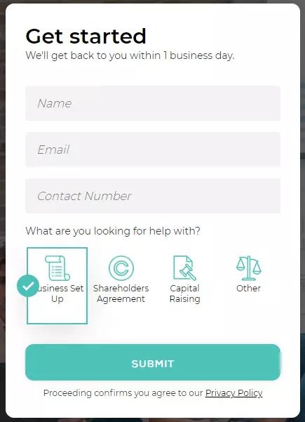
Another vital aspect of your landing page experience is the actual form where the user leaves their information. Some landing pages don't come with forms, but if yours does, you have to make sure it's optimized.
Here are some basic tips that can help you.
Use clear CTAs
You want to make sure that your CTA is easy-to-click. If you have a web page with multiple CTAs, the user should be able to easily select the one they want. You also want to make sure that any call-to-action is relevant to the ad, landing page, and user location/demographic.
The more contextual elements you can incorporate into an ad or landing page, the better your chance of getting users who are interested in what you're offering (i.e., clicking on your ads).
Create a call-to-action button that stands out from the rest of your ad. Make it larger, bolder, and different in color from the rest of the page.
Always optimize for mobile
The last thing you want is to have a great-looking landing page but a form that the user can't use. Make sure that your forms are optimized for mobile users because that's where you see the most challenges.
- Use a single-column layout
- Use large font sizes and contrasting colors
- Use large form fields (make them legible for the phone but not too large)
While you're at it, you should check and make sure that your site has a good mobile experience score from Google. Here's Google's mobile-friendly test you can use.
Advanced PPC landing page strategies
1. Optimize the page speed
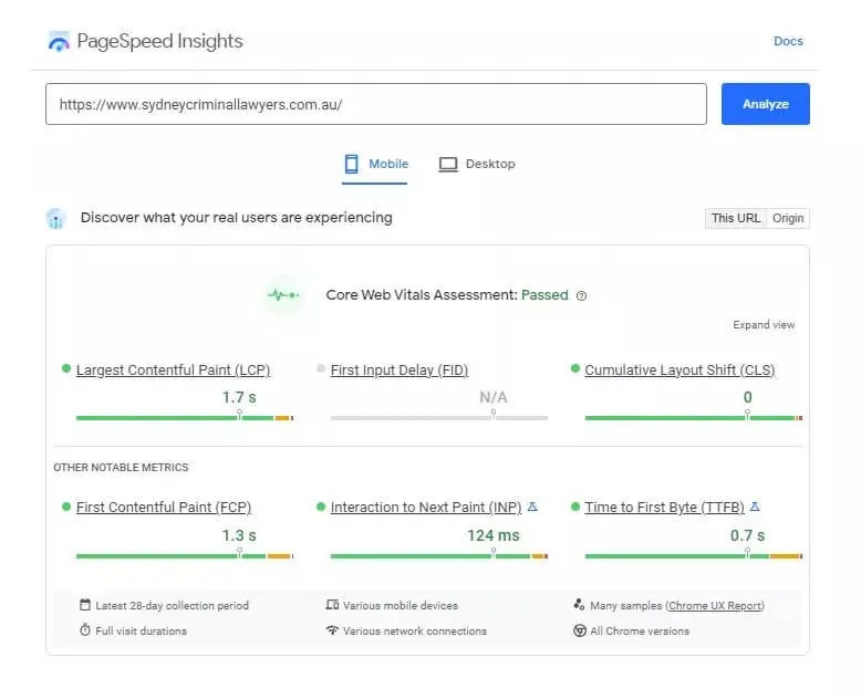
Your landing page loading speed is arguably the most critical of all components, page speed is the first contact with a potential customer and the quickest path to frustration. Google has even gone so far as to make it one of their SEO Core Web Vitals.
Google's recommendation according to their speed index is to have all your pages load in less than 3.4 seconds.
2. Maximise lead generation opportunities
Once on your page, it's important to give users every opportunity to take action. Be sure to have a phone number, email address, and a call-to-action (CTA) button sending users to the contact form section.
3. Use a sticky header
A sticky header is another crucial element to success. Have it follow the user down the page and only feature a short headline and a CTA.
If we think of a hypothetical scenario, I've clicked on your ad, read your landing page content, scrolled further down to try to understand it a bit more, and now the penny has dropped - I want your product.
But if there is no sticky header, I'll need to scroll back up to click on that email, phone number, or contact form navigation button. Should I bother or go back to the search results and try another company?
4. Match the content to your ad
Matching your target keywords to your ads and landing page content forms part of Google's Quality Score. The better the quality score, the more likely you rank in the auction without paying a higher price for each click.
Try to have your relevant keywords in the page title, the heading, and inside the first paragraph. Just remember to tell your story in a natural way.
5. Optimize the content length
Don't force your next customer down a funnel of seemingly endless text to understand your offering. What works best is a short paragraph letting them know they've come to the right place, with a few target keyword phrases sprinkled throughout the text.
There's no set length for a landing page, so continue A/B testing it and checking how it affects your quality score.
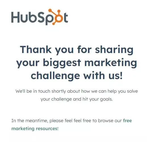
6. Create thank you pages
Triggering and detecting conversion events on the landing page is best, but not all sites are built the same. For those with difficulting tracking on-page activity, direct users to a thank-you page after completing the contact form.
You can use a thank you page to summarize your offering, re-state what the user signed up for, or include social proof and more ways for the user to engage with your brand.
7. Use Social proof
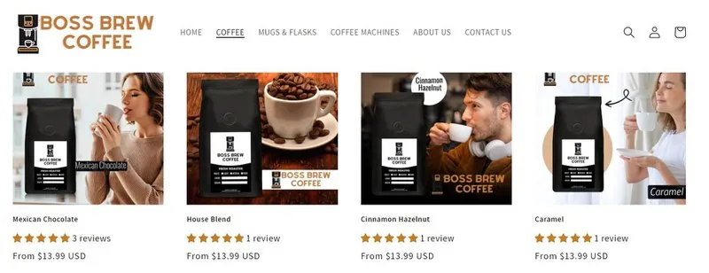
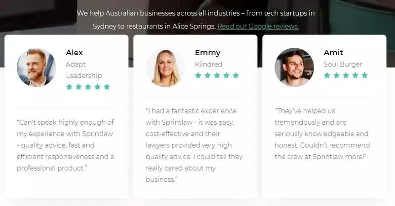
Featuring customer testimonials as social proof is another easy win for landing pages. It proves your service works, that you have satisfied customers, and people are willing to put their names behind it. Make your social proof stand out with things like eye-catching stars and bold quotes.
If you're an eCommerce business then display a few prominent customer reviews and also include the total number of reviews you have and your overall rating. It will help improve your landing page design, build rapport with your target audience, and improve your conversion rate.
Landing page optimization nice-to-haves
Now that we've covered the essentials, here are a few more aspects to move the needle.
Complementary colors
Paint all your lead generation buttons and links complementary to your site's primary color. So if you have a lot of purples, make these elements yellow or orange.
Large buttons
Following on from making your interactive lead generation opportunities as visible as possible, have them featured inside much larger buttons and fonts.
Video
Studies show that landing pages with video content can boost conversions by 86%. Make it easy for users to understand your message and interact with video content, ultimately reducing your bounce rate and boosting your quality score. Have it below the fold so it doesn't slow down the initial page load.
Certifications and partnerships
Prominently feature certifications and association partnerships to build on making your next customer feel at ease with your credibility. This will help you improve the landing page relevance and the user experience.
Granular user experience testing
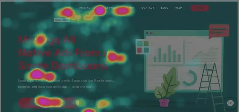
Your job isn't done after the page is live. Aside from using standard analytics to track conversions and build audience data, you could take things further by seeing how users interact on a more granular level - and then make it part of a continuous loop of learning and testing.
To get started, see if your landing page builder has anything native, or try tools like FullStory and Google Optimize.
Minimize the number of form fields
To let customers give you their details quickly and seamlessly, reduce the number of form fields as much as possible. Try to only ask for the information that you absolutely need from the customer. This will help shorten the path to conversion and get your more qualified leads.
Offer content in exchange
Providing an exclusive piece of content in exchange for the given conversion action hints at a mutually beneficial relationship. It creates longevity for your brand in the minds of users who still want to do a bit more research before committing. The latest salary and property guides are good examples.
Ready to optimize your PPC landing page?
It's absolutely essential that you optimize the performance of your Google Ads landing pages. It’s important that you have a clear, concise call-to-action (CTA) so your users can take action quickly. The form should be easy to fill out and make sure it aligns with the design of your page.
Every page should be optimized for mobile devices, have the conversion tracking properly installed, and use engaging images (no stock images) and videos.
Use some (or all) of our tips to build an absolutely awesome landing page, to maximize your chance of success with your ad campaigns. Want to take your campaigns to the next level? Work with one of our top Google Ads agencies today. Want to work with a specific expert to get a more personalized approach? Check out our list of the top SEM experts for hire.
FAQs
How do I create a Google ad landing page?
Here is a step-by-step process. (assuming you already designed and published the page on your site).
- Sign in to your Google Ads account
- Click on Keywords
- Add the Final URL column
- Click on the Final URL column for each keyword, click on the pencil icon
- Enter the landing page URL
- Click Save
How do I find landing pages on Google Ads?
Google Ads (previously Google Adwords) doesn't have a library of landing pages but you can definitely find and view your own.
- Click on the Ads & extensions menu
- Scroll over the ad you want to view and click on the pencil icon
- Click the arrow in the corner
- Click the URL options
- Click Test
Why do Google Ads use landing pages?
Landing pages play an important role in converting visitors into leads. When someone clicks on one of your ads, he expects to land on a page where he finds exactly what he was looking for. If he doesn't immediately see what he expected, he's more likely to click away from your site.
Can I run Google Ads without a landing page?
The short answer is no. Every Google Ad you run has to lead the user to a relevant landing page on your website. It could be a custom landing page off-site but there has to be something. The only exception is when the conversion event is a call (for Google Call Ads).
Google Ads that display on the search engine results work the same as organic search campaigns. The user sees a headline + URL and clicks on it. So it must lead to some kind of page.
Which is the best practice for optimizing a landing page for Google Ads?
The short answer is that your content should be easy-to-navigate. The long answer is that there are a ton of different factors that could affect Google's quality score, ad position, bounce rate, click-through rate, and conversion rate. Here are our best tips:
- Make sure there's a message match
- Use appealing videos and images
- Display lots of social proof
- Make your content easy to read (with lots of white space)
- Make sure your conversion tracking works
- Get a better idea of the audience you should target by looking at your Google Analytics
- Use landing page templates to get ideas
- Optimize your landing page loading speed
What is the difference between the display URL and the landing page URL?
The display URL is the green URL that appears directly below your ad headline on search engine results. The landing page URL is the final URL (sometimes called the post-click landing page URL) that the user lands on when they click on the ad.








![Budget for Google Ads: How Much Should You Spend? [{Year} Truth]](https://entail.mayple.com/en-assets/mayple/fit-in/280x280/budgetforgoogleads-1714645624013.jpg)