Top Unsubscribe Button Best Practices (+ Examples)
Following unsubscribe button best practices can actually boost your email campaign metrics, your email reputation, and your brand reputation. Learn how.
Updated November 6, 2024.
What’s the secret to building a great email marketing program? Invest in the details of your emails and don't miss out on important opportunities to ask users for feedback, especially when it comes to your unsubscribe button.
As marketing professionals, we fiercely guard and nurture our email contact lists. We want to wow stakeholders with a report on email marketing that shows excellent engagement rates and a positive impact on sales.
That's why feedback is a keyword when it comes to a great unsubscribe email flow, and the good news is that it doesn't have to be a complicated process. Your unsubscribe button can be an effective way of getting feedback from users on unwanted emails, complying with important laws such as the CAN-SPAM Act, and getting marked spam by email clients even on daily emails.
Let's discover how you can take a proactive approach to your unsubscribe email strategy, and improve email metrics and customer satisfaction.
What is an unsubscribe button?
Look closely at one of the email newsletters in your inbox. Near the social media icons on the bottom, you'll likely notice a sentence offering you to unsubscribe, with that word hyperlinked to a landing page.
Here's how Mayple does it in our newsletters:
This is quite typical in the average email.
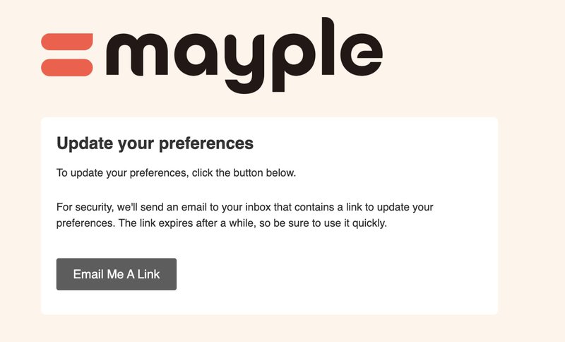
Depending on how much content and promotional emails the company sends out, you might also be given unsubscribe alternatives such as the option to change your email preferences,
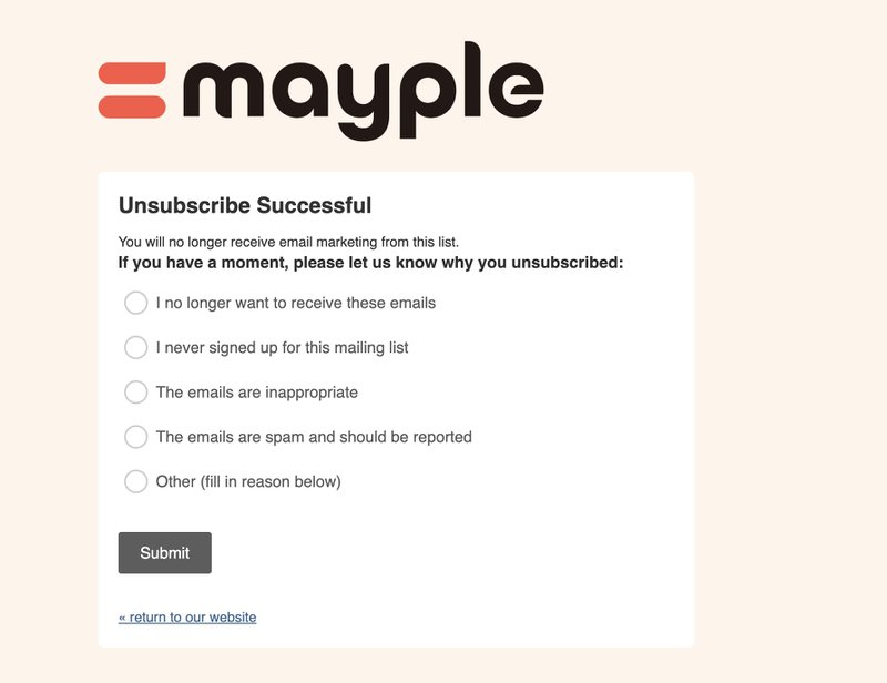
or unsubscribe completely. If you unsubscribe, you will often be directed to a landing page with an unsubscribe confirmation message.
Notice the neutral tone and the clear language in this unsubscribe page example.
This particular flow takes advantage of the opportunity to gain valuable feedback. For example, if people only check personal emails on weekends, they'll feel bombarded by the time they get to their inbox if the frequency of emails is too intense throughout the week.
Note that most email marketing platforms will offer a landing page template like this for effective email user experience design.
You might also be presented with a re-subscribe button just to give you one last chance to stay in the loop.
Do you need an unsubscribe button in marketing emails?
Absolutely. Here are the top reasons why:
1. It's the law.
The most basic reason for providing an unsubscription process for your audience are the legal repercussions. Certain email clients have a built-in unsubscribe option, but that is not enough. Not having a process where users opt into your newsletters, as well as a way to opt-out, leads to hefty fines and even email account suspension.
According to America's CAN-SPAM requirements, you need to provide a clear and easily noticeable method for subscribers to say "no thanks" to receiving your commercial emails. This means letting them know how they can opt out of getting future emails from you with an easy-to-find unsubscribe link.
2. The unsubscribe experience is part of your brand experience.
Your goal is to avoid customer frustration with your messages so that they don't regret giving you their email address.
A proactive approach to this means including a simple survey in your unsubscribe page message where people can let you know why they are unsubscribing, or what types of content they'd have liked to receive from you. This kind of feedback from subscribers helps you avoid a frustrating experience with your brand.
3. Your email reputation depends on it.
And lastly, email deliverability matters—a lot. Remember: you want a clean list of contacts in your target audience that engage with your emails. You don't want to harm your email reputation or your campaign metrics with large contact lists of people who never open your emails.
4. A successful email marketing program speaks directly to respective audiences
You don't want to sabotage your campaign metrics by holding on to contact lists where are large percentage of people never open your emails.
To make sure that you're providing the best value possible in your email campaigns, let's first take a look at why someone would want to unsubscribe from your email newsletters or other messages.
Psst! Expert tip: if you want to be confident that your email campaigns are providing value to your audience, you can opt to work with a Mayple-vetted email consultant. We'll match you with the right expert for your industry in days.
Why do users unsubscribe from email lists?
Users unsubscribe from email lists due to:
Email frequency overload: When email recipients receive messages too frequently, they can become overwhelmed and opt out in order to regain control over their inbox.
Your content is no longer relevant: If the type of content in an email no longer matches subscribers' interests or needs, they might perceive the messages as irrelevant and decide to unsubscribe.
Subscribers had different expectations: When the content of emails don't align with what subscribers initially signed up for, they may opt out due to unmet expectations.
Accidental unsubscribes: Unclear unsubscribe processes or confusingly placed buttons can lead to accidental unsubscribes, frustrating recipients and causing them to leave the list.
Inconsistent communication: Inconsistencies in email communication patterns, such as random sending or varying content quality and confusing language, can lead to disengagement and, ultimately, unsubscribes.
Users subscribed to access gated content: Subscribers who join to access specific gated content may not be a relevant audience for ongoing emails. They might not want to get your biweekly newsletter and learn about your latest blog entry, for example, and will unsubscribe. If you release enough content, you can provide alternatives to the email messages they receive from you.
Allowing users to unsubscribe is scary. We get it. But building up negative associations with your brand may cause a mass exodus from your list down the line anyway.
As with all email marketing best practices, it's about assessing your results, and seeing how you can improve your marketing strategy in future campaigns to ensure a positive experience with your brand.
Best button and unsubscribe page examples
Heyday is a skincare company with spunk. Notice how they use their brand to make their unsubscribe options stand out. They also give you the option to opt out of the specific type of email campaign or all of their emails completely:
Lavendair stays on-brand with a simple and sincere unsubscribe message.
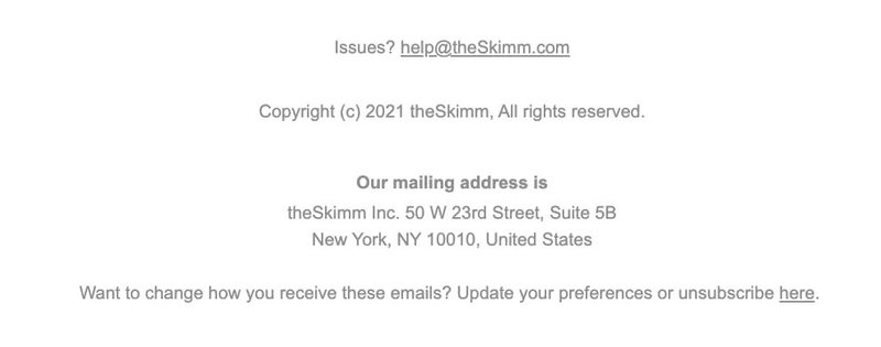
The Skimm gives you one link that leads to an unsubscribe page message where you can set your email preferences or stop receiving them completely. This allows for a simpler process, with no need for the reader to choose between links, while still helping them feel they have a choice, if that makes sense.
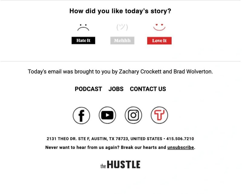
The Hustle pushes the envelope slightly with a cute unsubscribe line. Unless this type of message would be aligned with your brand, you want to be careful to not annoy your readers.
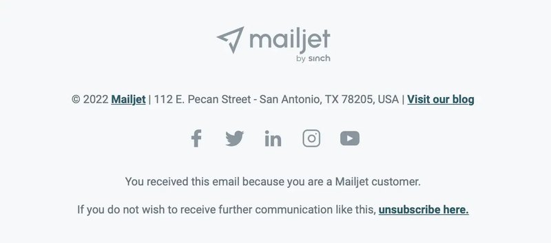
Mailjet keeps their unsubscribe clear and on point. They remind you that you opted to receive the email when you became a customer, and then they place the unsubscribe link in bold and at the end of the sentence so that it's easy to find.
Best practices for your email unsubscribe button
To make sure that your target audience enjoys your content, and that your list is cluttered with unengaged contacts, there are a few ways to make the unsubscribe process easy:
Understand spam laws.
Comply with local regulations like the CAN-SPAM Act Rules for the US, or the Data Protection Act in the United Kingdom (an adaptation of the EU's GDPR), depending on your contact base. Being mindful of every email address you receive is an important element of your email marketing strategy.
Use a polite tone of voice. Avoid a snarky, off-putting tone.
Use clear, friendly language such as "Update Email Preferences" to provide a positive customer experience. But avoid an excessively silly tone, as well. Remember, you're not trying to burn bridges with people. You're just helping lighten the load on their inbox, giving recipients alternatives whenever you can.
Create an unsubscribe button that's easy to find.
Make the link noticeable. Place a distinct unsubscribe button prominently using design elements like color contrast. Also, place it near the social links, where we now expect this button to be, and be sure that the footer of your email template is visible on a mobile device, as well.
Simplify the opt-out request process.
Provide minimal steps and no unnecessary information requests or steps like email authentication. The double opt-out is a sort of approach that might have its place, but it's a consideration that should be weighted heavily.
Provide a single opt-out where possible.
Offer a single opt-out feature for all email communications to simplify the process. A one-click unsubscribe button is ideal for truly uninterested recipients, but it is admittedly an opportunity lost in your email marketing efforts.
Strategize for retaining subscribers.
A secondary button for simply minimizing your future communication to more relevant content is worth including on the confirmation landing page. Provide options for preference updates or less frequent communications as discussed in the post-purchase email article to retain subscribers.
Need help? Get expert guidance.
Seek insights from email marketers or an email marketing consultant for even more successful email marketing efforts.
Re-engage inactive contacts.
Your audience may not be up for a weekly newsletter, but that doesn't mean they're not interested in any of your marketing messages. Remind users of your value, as with a winback email, or create a re-engagement email drip campaign. You can even send out e a quick survey to re-engage inactive subscribers. Just remember to always comply with anti-spam laws.
Unsubscribe button: an essential element for any successful email program
Of all the important links in emails sent to your contacts, the unsubscribe request is one of the most important ones. You might be doing all of the right things. Your email subject line was spot on, your custom font looked good, the email design was carefully thought out. But maybe it's just not the right time for your contacts to hear from you, or they're not in your target audience anyway.
The unsubscribe button and unsubscribe confirmation page are an important way to make sure that you're sending emails to people who actually want to hear from you – driving your engagement rates, your email deliverability, and eventually, sales.
Need a hand with crafting stellar email content that includes all of the email marketing best practices? Contact Mayple and get matched up with one of our vetted email consultants in days.
FAQs
Where should I place the unsubscribe button?
The unsubscribe link – a must-have in every email campaign – is commonly found in the email footer near the social media icons, giving people the opportunity to opt out of receiving your emails. This strategically positioned lin is vital for complying with email marketing regulations and respecting recipients' preferences.
Example of Unsubscribe Placement:
[View Online] | [Unsubscribe] | [Contact Us]
Your Company Name | Address | Phone Number
In this example, the "Unsubscribe" link is clearly visible and logically placed alongside other relevant links in the footer. This design provides recipients with an easy way to unsubscribe while maintaining a professional appearance for your email.
What is a healthy unsubscribe rate email?
A general benchmark for unsubscribe rate is typically below 0.5%, but of course, this does vary per industry. If it's under 0.2%, you're in the normal range. However, if your metrics show a rate over 0.5%, it's time to start asking users for feedback on where you can improve.
Do all emails need an unsubscribe button?
Yes!
People have the right to reject subscriptions and opt out if they no longer wish to hear from you. This is why including an active unsubscribe link is a legal requirement, despite the fact that most email clients do have a built-in way for users to unsubscribe from emails, themselves.
Not only that, but it's an important part of your brand experience, as well.
What is the purpose of unsubscribe?
The purpose of the unsubscribe button is to allow users to opt out of receiving further emails. This action reflects their preference to stop receiving messages. Unsubscribe rates are often tracked as a metric in email campaigns.
As such, it's also a great source of feedback on how you can improve your email marketing program.
What are the GDPR unsubscribe rules?
Under the General Data Protection Regulation (GDPR), there are specific rules and guidelines regarding unsubscribing from email lists:
Transparency and Clarity: The GDPR emphasizes transparency in data processing. This extends to unsubscribing from email lists. All outbound messages, including email marketing communications, must clearly specify the method through which people can remove their data from your mailing list or make changes to their information.
Recipient Control: GDPR underscores the importance of giving recipients control over their data. This includes providing them with an easy and straightforward way to opt out of receiving further emails. While the regulation doesn't explicitly mandate the use of an "unsubscribe" link, it does require a clear and effective mechanism for people to express their preference to stop receiving emails.
Flexibility in Implementation: The GDPR does not prescribe a specific format or terminology for the unsubscribe mechanism. While "unsubscribe" links are common and widely recognized, the regulation does not mandate their usage. This flexibility allows organizations to design the unsubscribe process in a way that aligns with their branding and communication style, as long as it is easily understandable and accessible.
Consent and Processing: Unsubscribing from emails is closely tied to the consent given by the recipient. GDPR mandates that consent for data processing (including sending emails) must be freely given, specific, informed, and unambiguous. People should be fully aware of what they are consenting to and should have the ability to withdraw that consent easily.
Prompt Action: GDPR stipulates that requests to unsubscribe or remove personal data should be acted upon promptly and efficiently by the data controller. Once a recipient expresses their wish to unsubscribe, their data should be removed from marketing lists without undue delay.





![21 Best Email Marketing Tools to use in {year} [Free & Paid]](https://entail.mayple.com/en-assets/mayple/fit-in/280x280/62e10f114e79bb206d20817d_topemailmarketingsoftwaretools1_c42d224ca7dd5992aa4df6123265cde6_2000-1699775508243.jpg)
