[Guide] How to Write an Email Preview Text to Inspire Clicks + Examples
Investing into your email preview text sets you apart from your competition, and encourages potential clients to open your email. Get tips to do this right.
Updated November 5, 2024.
![[Guide] How to Write an Email Preview Text to Inspire Clicks + Examples main image](https://entail.mayple.com/en-assets/mayple/64aeffb50397d41ab5aa380c_3031200x675mayplefp169189_0273a99d430548e6c54143747665786d_2000-1699518255187.jpg)
Email subject lines tend to get all the spotlight whenever someone talks about good email marketing – but the preview text can be just as important.
Preview text is as valuable real estate as the front porch of a nice house. Where the subject line gets the attention of users, good preview text makes them want to commit to opening your email. After that, it's all a curiosity slope.
Or, as Joseph Sugarman put it, "Your readers should be so compelled to read your copy that they cannot stop reading until they read all of it as if sliding down a slippery slope.”
So how do you write a preview text that gets your readers and keeps them interested enough to read through your email? And should preview texts have a specific length for a good user experience?
Read our guide on writing preview texts your audience will resonate with.
What is the preview text?
An email preview text is a snippet of information meant to describe your email, displayed as a preview in the inbox. Most major email clients will show the preview next to the subject line, to draw the audience's attention and increase email open rates.
The preview helps intrigue the recipient before they open the email and should be short and sweet, typically between 40 and 140 characters, depending on the email client.
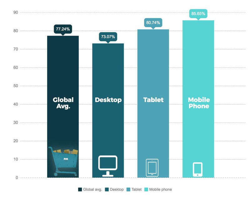
Take abandoned cart emails, for example. While most people are used to the traditional "Hey, you forgot something in your cart", the white space right next to the subject line can be an opportunity to remind people why they added the item in the first place.
Preview texts like "We really like your taste in dresses, {name}," "Here's a coupon code to help you out," or "Your new fit self is waiting!" can entice users to click on the email, look at the product again, and finish the transaction. A simple tactic like this can reduce cart abandonment, increase engagement, and potentially boost sales.
Can you skip the preview text?
Is skipping the preview text a good idea?
The short answer is no.
While it might be tempting to overlook this small detail, doing so could negatively impact your email marketing efforts. The preview text is valuable for engaging subscribers and convincing them to open your emails.
If you skip the preview text, email clients usually generate a default snippet based on the first few lines of your email. This likely won't capture the essence of your message or entice your audience to read further.
Crafting preview text gives you control over what your subscribers see in their inbox, allowing you to adjust the text to your tone of voice and deliver the right message to your audience.
Many digital marketers use the same text for the subject line and the preview, but that's not necessarily the best way to go about it. You should look at your preview text as valuable space – it's extra room to get your potential customers more interested in your deals.
Investing time and effort in creating captivating preview text can lead to higher open rates and better engagement. In other words, if you're not using a smart preview text, you're leaving customers in front of your store instead of inviting them in.
Advantages of adding a preview text
Whether you're a B2C or B2B marketer, you should consider preview texts as an integral part of your email copywriting strategies. Here's why:
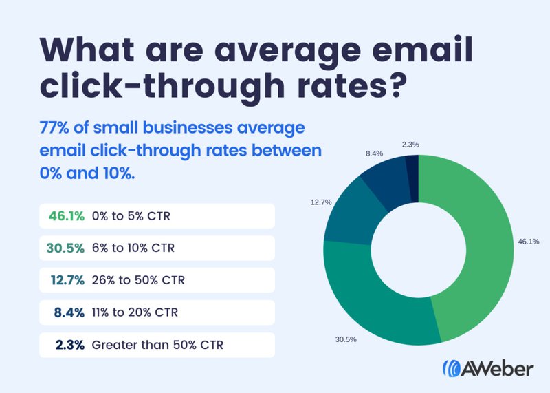
- Boost in open rates and click-through rates. Research shows that using preview text can boost click-through rates by a staggering 30%. Makes sense, right? Compelling preview text significantly boosts open rates by capturing subscribers' interest and motivating them to explore your content further.
- Better inbox presence. Preview texts provide more context to your subscribers. For instance, they can highlight critical insight or a call to action (CTA) to improve click-through rates, as well as present your tone of voice to increase your brand recognition.
- Visibility on mobile. 41.6% of email opens happen on mobile devices, with webmail coming in second at 40.6% and desktop platforms accounting for 16.2%. Thus, mobile optimization is key. With high visibility on mobile devices, a preview text ensures your message reaches your (likely growing) mobile audience.
Moreover, well-structured preview text can reduce spam complaints. When they understand the email’s purpose, recipients will be less likely to mark it as spam. Instead, they will receive more effective email campaigns, fostering a stronger connection with your band, and ultimately leading to improved customer experience.
Difference between preheader and preview text
Both preheaders and preview texts have a similar goal: to get people to click on the CTA button. However, they're placed in different areas of your email and frequently use different copywriting techniques to engage readers.
Preheader text
In a nutshell, the preheader text is the text your email subscribers see just above the header area in your email – after they've clicked on the subject line and opened it. While they may be useful, preheader texts are less common in most emails these days, largely because the extra space above the email header is used for branding and user experience-related purposes.
Preview text
In contrast, preview text appears in the inbox view next to the subject line and it can be an excellent way to connect your subject line with the actual email content.
What should the preview text include?
You can use preview text to provide additional information, such as the main headlines in a publication, a summary or your email, or a hint at a curiosity gap. For example, if the subject line says, “50% off new arrivals”, the preview text might mention how long the offer will be available and create a sense of urgency in shoppers.
To craft an appealing preview text, you should
- Highlight the email’s main point: Convey the primary message or offer to give people a reason to open the email.
- Incite curiosity: Pique the reader’s interest by hinting at valuable content or exclusive information without giving everything away.
How to add preview texts to your emails
Adding a preview text to your emails depends mainly on the email service provider (ESP). Most email marketing tools, such as Mailchimp, Drip, Aweber, and Campaign Monitor, allow you to add preview text to your emails during email creation.
Some platforms may automatically generate preview text based on the email’s content if you don’t provide custom information. Review the automatically generated text to ensure it aligns with your messaging and goals.
No time to fine-tune your email copy? Hire an email copywriting specialist on Mayple. We'll match you with the perfect one within days!
The ideal length for preview text
How long should the email preview text be?
The perfect email preview text length depends on the email client (Google, Outlook, etc.) Each of them has unique character limits:
- Apple Mail: 140, 87 (iPad), 81–137 (iPhone)
- Gmail: 97 (web), 90 (iOS), no specific number (Android)
- Outlook: 55 (Mac), 35 (Windows), no particular number (web)
- Yahoo Mail: 45–50 (mobile app), no specific number (web)
To ensure maximum visibility across various clients and devices, aim for 40–90 characters for the preview text and about 60 characters for the subject line.
How to deal with different email clients’ character limits?
Handling varying character limits in email clients can be challenging. You can partner with an email copywriting freelancer to help with preview text creation or do it independently. Here are four practical approaches to ensure your preview text displays well across all platforms:
- Bite-sized chunks: Write short sections of preview text separated by symbols like “|” or “–.” This move prevents email clients from cutting off long texts awkwardly and boosts the visibility of important information.
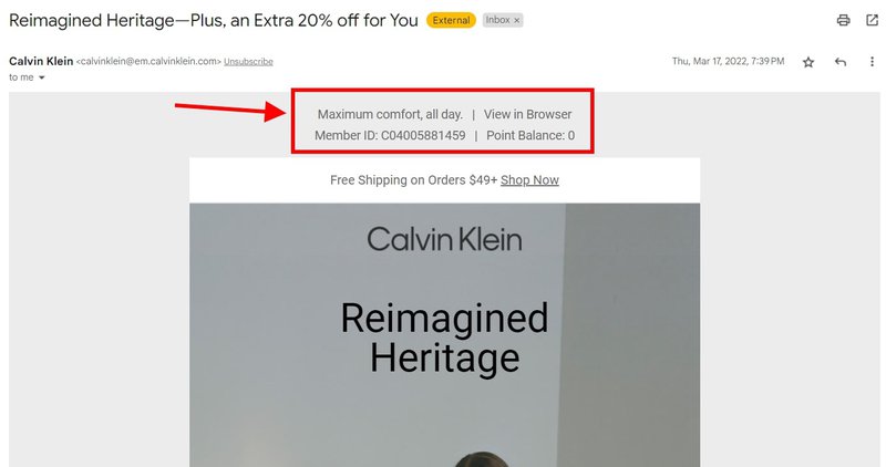
- Flow into the opening: Create a smooth transition from your preview text to the email’s opening lines. To achieve this, remove any preheader text (e.g., “View in browser”) and use punctuation marks to signal the end of the preview text and the beginning of the email.
- Repeat critical points: Highlight essential information by repeating it within the preview text, filling the space, and accommodating various character lengths.
- Insert blank space: Use space strategically to create a clean look and draw attention to your email. Ensure there’s enough space to avoid random gaps between the preview text and the email greeting.
- Stay on the lower end of the character limit: Write preview text within the lowest character limit (around 45 characters). Incorporate additional information if necessary to make it engaging and informative.
How to optimize your preview text
Preview texts come with quite a hefty limitation, but crafting good ones doesn't have to feel like an impossible mission. Here are some best practices to help you make the most of your preview text:
Complement your subject line
Your preview text should be consistent with the subject line to prevent confusion. If the subject line mentions a limited-time offer, the preview text should highlight its key details and/or create urgency. Consistency between the subject line and preview text creates a comprehensive image, making the message more thoughtful.
Provide a clear message
To cut through the noise on your potential-customer's inbox, you should
- Provide front-load information: Place important details at the beginning to ensure they’re visible across email clients.
- Avoid clickbait: Craft a genuine preview that accurately reflects the email content, building trust with recipients.
- Opt for short sentences: Use concise, punchy phrases to deliver a clear message within character limits.
Need some more inspiration? Check out our guide to the best email marketing examples.
Avoid repeating information
Don't settle for rewriting your subject line in your preview text. Use it to bridge the subject and the content of the email. If your subject line announces a sale, use the preview text to highlight a specific deal (e.g., “30% off selected items”) or hint at a promo code. The main idea is to encourage recipients to open the email and discover more.
Always A/B test
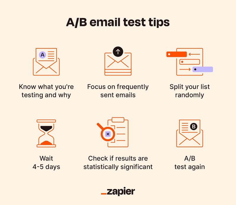
The best email marketing is the result of continuous fine-tuning – and A/B testing is a huge component in that. Just like your subject line, email header, and even CTA button, your preview text can be A/B tested as well. Here are some tips to help you use A/B tests effectively:
- Always test one element only (e.g., your preview text OR your subject line, not both in the same experiment)
- Create two or more distinct options, each with unique messaging or keywords
- Split your audience into equal segments and assign each a preview text variant
- Keep track of open rates, click-throughs, and other metrics to identify the top-performing version
- Apply the winning preview text to refine your approach and improve your email marketing
Keep preview texts shorter
Shorter previews can enhance engagement and readability, especially on mobile devices. Here’s how to keep your preview texts concise:
- Limit character count to 40-50 to ensure clear message across devices
- Pick powerful yet brief phrases to convey your intent effectively
- Focus on the most enticing aspect of your email content
- Use punctuation and emojis sparingly; they clutter up valuable space
Include key terms at the beginning
Positioning essential keywords at the beginning of your preview text leads to better engagement. To do this, stress the main value proposition early on. For example, you can use “Free shipping” or “Exclusive tips” to emphasize the value of what you're offering. Also, use action verbs to prompt engagement, such as “Discover,” “Learn,” or “Save.”
Just make sure these words don’t look too intrusive – there's a fine line between being salesy and smooth copywriting that attracts and engages audiences.
Add an incentive
Who doesn’t like perks? We seek good bargains and are more likely to consider such offers. So incorporating incentives in your preview text can do the job. Identify a compelling offer, such as a “Bonus gift” or “Early access.”
Communicate the incentive’s value to your audience with phrases like “Save 20%” or “Unlock expert advice.” Remember not to overpromise or exaggerate the bonus, as it’s essential to maintain credibility.
Create urgency
Maximize your preview text effectively by instilling urgency:
- Use time-limited phrases, like “Offer ends today” or “Last chance to join”
- Add examples, such as “3 hours left” or “Only five items remaining”
- Match urgent statements with your subject line and message
Draw attention
How else can you make the preview text stand out? Trigger emotions and draw attention with the help of the following:
- symbols like “★” in social proof emails
- emojis, such as 🔥, 🚀 to incite curiosity
- exclamation marks to show excitement
- Intriguing questions, like "Ready for a game-changer?"
Include a CTA
Entice readers with an irresistible CTA in your preview text. It can be something like “Grab your free ebook” or “Reserve limited seats.” Add more benefits with phrases like “Boost productivity by 50%” or “Experience exclusive content.”
Your CTAs can be even more specific, like “Join our masterclass today” or “Claim your discount before it expires.”
Remember: the CTA should always be genuine and achievable, as trust plays a crucial role in email engagement.
Personalize the text
Everyone appreciates a personal touch. You should also leverage the opportunity to connect with readers by personalizing preview text. Add customized elements, use recipients’ names, or mention their interests to create an instant connection.
For example, try "[Name], boost your photography skills today!” or “Unlock expert tips for avid travelers.” Keep the tone conversational and genuine, avoiding robotic language. Personalizing your preview text will foster a sense of familiarity, encouraging readers to engage with your content.
3 preview text examples to inspire you
Now that we have gone through some best practices, let’s delve into some best email preview text examples.
Underlining the benefits: Calvin Klein
Adding more information: Justin Welsh
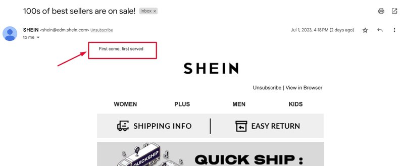
Creating urgency: SHEIN
The payoff of investing time into writing killer preview texts
Your preview text is a critical element of your email marketing campaign. Your subject line may stop the scroll – but the preview text has the power to make people click. And while crafting good preview texts may be challenging in some ways, the effort will be more than worth it.
Looking for an email marketer to help you out?
Contact Mayple and allow us to match you with the best email specialist for your industry and niche so you can get down to work in a matter of days.
FAQs
What is the importance of preview text?
We all know that subject lines have a character limit. What real experts understand is that the preview text allows marketers to use a bit more space to persuade their audience to open their emails.
What is the character limit for preview text?
What is the difference between subject and preview text?
