How Koala went from $0 to $13M in 12 months with email marketing & site optimization
Koala is one of the first DTC mattress companies to make it big. Here is their 9-email long sequence that spans 3 weeks. Plus other marketing strategies.
Published November 5, 2024.
Koala is an Australian mattress company that has taken the world by storm. There’s a lot to talk about here because this brand’s marketing is so on-point - from their emails to their packaging, customer service, to checkout optimization.
But we are going to focus on two main things - email marketing and site optimization.
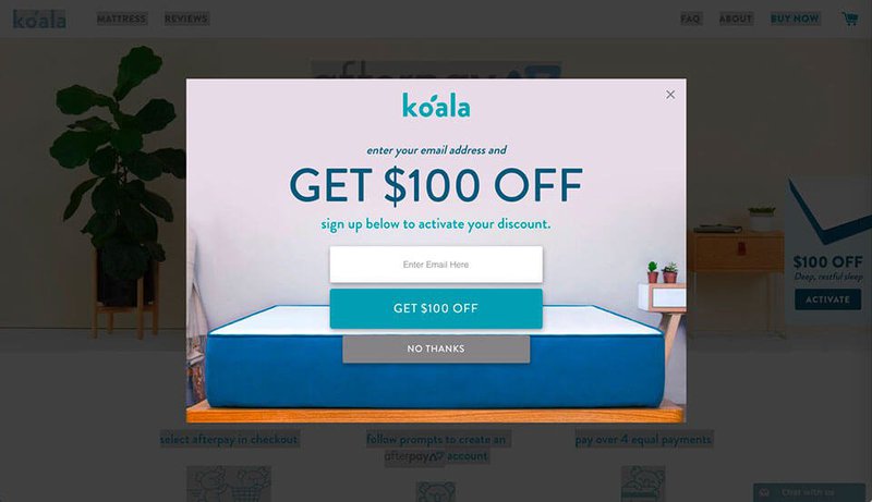
So, here’s how Koala absolutely crushed it in email marketing. First, they have a prominent exit popup:
Now that’s a really great deal if you consider the rest of their value proposition:
- free shipping
- 4-hour delivery (for some locations)
- a 120-night trial.
- 10-year warranty
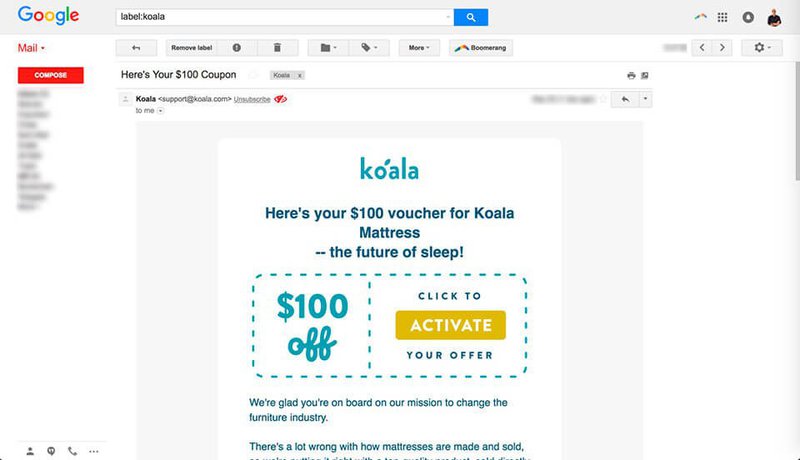
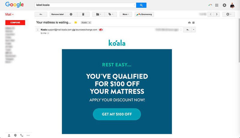
When you sign up for that $100 offer you receive this email:
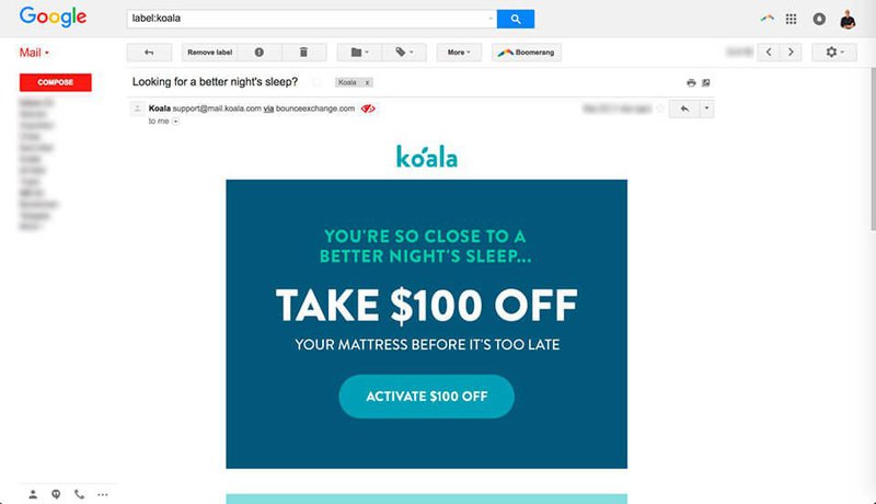
Then exactly 40 minutes later you get the second email:
Notice that the first email looked like a coupon, to match the user’s expectations. And the second email looks more like an email, testing a different look. Then, 24 hours later you get the third email:
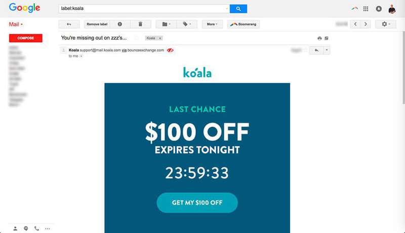
Then 24 hours later you get the fourth email, this time it has a countdown timer for more urgency:
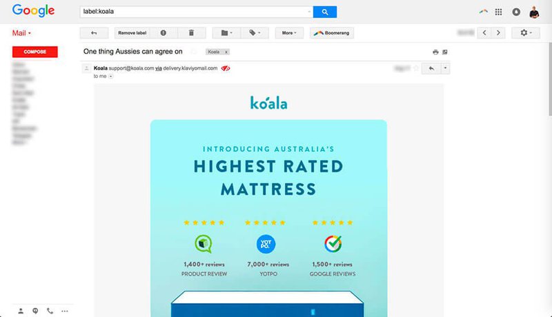
Then, in 48 hours they send this email. This time instead of pushing the discount offer they highlight how much their customers love the mattress.
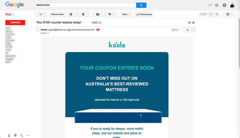
Then 3 days later you get this email:
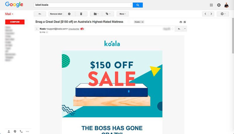
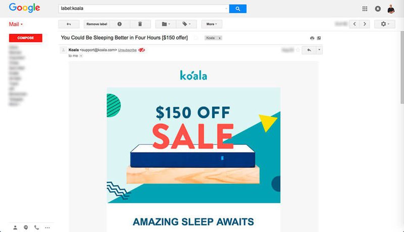
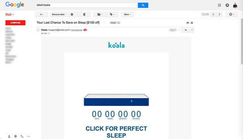
Then after 2 weeks, they send you another 3-email sequence, testing out an even bigger discount. Why 2 weeks? I’m assuming they spend that time retargeting you on social media and online publisher sites.
Here’s the first email in the sequence:
Here’s the second email:
And here’s the third in the sequence:
That timer is pretty convincing, isn’t it?
So Koala has 9 emails in this particular email flow.
When most brands stop at the third email, Koala tests out different formats, images, and offers over the course of 3 weeks with 9 different emails. 📥
Here is the flow again: $100 off, sent immediately Email 2: sent after 40 minutes Email 3: Day 2 Email 4: Day 3 + countdown timer Email 5: Day 5 + product reviews Email 6: Day 8 + 120-nights trial Email 7: Day 22 + $150 off Email 8: Day 23 Email 9: Day 24
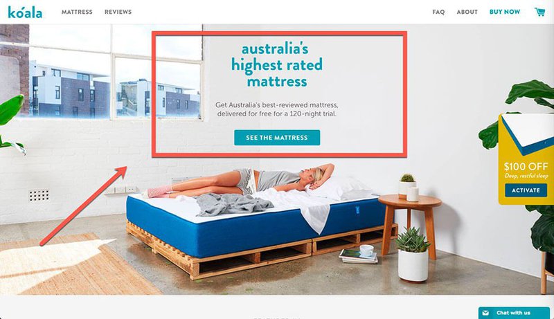
This flow wouldn’t be as powerful if Koala didn't also optimize their site for maximum conversions. Here’s what their home page looks like:
A few key points that make Koala’s home page a conversion rate optimization masterpiece:
- The menu is super simple - it has 5 buttons. On the left, it’s just “mattress” and “reviews”, a brilliant way to have the customer focus on what matters right away.
- Super short-form content - the content blurb highlights 3 selling points in a very short and concise way (best-reviewed, free delivery, 120 nights trial). The fewer words the better, they really let the image tell the story.
- Everything is above the fold - all the important elements are above the fold. The menu, the CTA, the sliding popup on the right, and the checkout.
So if you are struggling with conversions on your eCommerce site, test out simplifying your top menu, shorter text, and placing everything above the fold. Try that variation for 2-4 weeks and see how your conversions do.


![21 Best Email Marketing Tools to use in {year} [Free & Paid]](https://entail.mayple.com/en-assets/mayple/fit-in/280x280/62e10f114e79bb206d20817d_topemailmarketingsoftwaretools1_c42d224ca7dd5992aa4df6123265cde6_2000-1699775508243.jpg)
