120 Best Browser Abandonment Subject Lines Examples + Tips
If you're not following up with customer's after they've browsed your site, you're losing out! See our browser abandonment email subject lines and expert tips.
Updated November 6, 2024.
The internet is built on two main elements: advertising and attention. Everything else – i.e. content, commerce, and algorithms – is built to support the relationship between internet users on the one hand and businesses and advertising networks fighting for human attention on the other.
Getting people to browse your website is difficult – but making sure they stay in the customer journey is where the work really starts. Email marketing can help you keep your online shoppers close and build a positive customer experience.
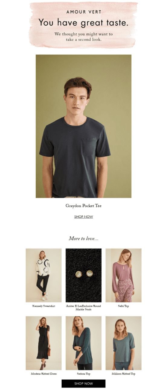
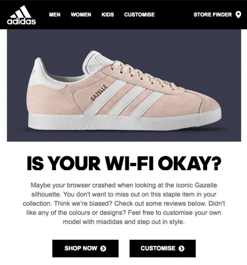
Just like cart abandonment emails, browse abandonment emails for shoppers are like little nudges to busy shoppers reminding them of you and your store. These emails can enrich your customers' purchase journey, make online shoppers more likely to follow through with their purchase intent, and help boost your online store’s bottom line.
How to create browse abandonment subject lines your email subscribers can't resist?
For this article, we looked at successful browse abandonment emails and came up with no less than 120 email subject line examples you can use for this purpose. Read on and get inspired!
Browse abandonment statistics
According to SaleCycle, the eCommerce abandonment rate in 2023 is 79.5% – a staggering yet realistic number, considering the number of shoppers who give up on their purchase before checkout. The good news? Browse abandonment emails work. They have an open rate 80.9% rate and a 50.5% click rate, compared to more general types of marketing emails.
Why are browse abandonment emails effective?
Browse abandonment emails have grown to be very important in email marketing strategies, as they remind registered users of items or product categories they've viewed on your site. Essentially, a browse abandonment email strategy is based on sending email automations to registered users who've visited your site but did not add anything to their cart.
Online window shopping is a reality, but it doesn't mean people who browse your site and don't buy aren't actually interested in what you're selling. On the contrary: when online shoppers browse your site's product pages, they show a good level of purchase intent. So sending abandonment messages is a way for you to reconnect, rather than push for a sale.
Like shopping cart abandonment emails, there are many ways to send relevant messages to those who show consumer buying intent. And while many brands may create poor user experiences by being too invasive and pushy, plenty of businesses manage to do these types of automated marketing flows in a way that feels genuine.
It all lies in how you incentivize people to add their items to the cart and proceed to checkout.
Tip: Not enough time on your hands to build email marketing campaigns that build rapport, convert, and create a loyal customer base? Hire an email marketing agency you can rely on.
Browse abandonment subject line best practices
Although there's no set recipe on how to write a subject line that attracts and engages your audience, there are some simple best practices the best email marketers always keep in mind:
Keep it simple
Think of your subject line as a headline. Keep it short and sweet, use keywords that show relevance to the item your customer was looking at, and grab attention with relevant words like "yours" or "your."
Also, ensure it isn't too pushy, especially if the text is making any false claims. Making your subject line more salesy works well when you're running a limited-time offer, for example, but it may be too much for a browse abandonment email.
Mind the character count
As a general rule, subject lines should be kept around 50 characters. Your message may end up truncated if it's too long, so keep that in mind when crafting the perfect subject line for your browse abandonment emails.
Use the right punctuation
Punctuation can not only make your subject line stand out but also highlight certain words. Think of it as an opportunity to draw attention to words such as "now" or "free." Also, using symbols like an exclamation mark is a surefire way to make your subject line pop.
Make sure you have a strategy in place
The effectiveness of browse abandonment emails depends on your strategy. Think about the timing, that is when should you send a browse abandonment email after someone has left your website, and how you want to approach this (e.g., will you add some sort of incentive to make them come back?).
Continuously test and optimize
The only way to see what works best for you is to continuously test different subject lines, offers, headlines, and more. Some A/B testing is necessary to understand what message resonates better with your target audience at any given time.
Don't be overbearing
Nobody likes being assaulted with sales messages, so make sure your browse abandonment emails are not overbearing or too pushy. By understanding what shoppers' expectations are and offering them relevant and helpful messages, you'll see better results with browse abandonment emails.
To that avail, avoid sending too many browse abandonment emails and avoid making them too pushy too. Remember there's a reason people may have just browsed your website, and tap into that – whether it's by using the fear of missing out, a discount, or a fun, punchy line that'll make your brand more endearing to customers.
Top ideas for browser abandonment subject lines inspiration
Not sure where to start with your browse abandonment emails? Here are some top ideas to help you come up with the perfect subject line.
Simple subject lines
Simple subject lines are great for browse abandonment emails. They're more personal and less intrusive – perfect when you don't want to be too pushy, but still want to remind customers of items they viewed on your website. Here are some examples to inspire you:
- Did something catch your eye?
- Complete your visit with these picks!
- Hey there, still interested?
- Don't let your favorites slip away!
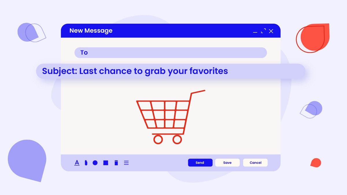
- Last chance to grab what you liked!
- Your recent visit awaits completion!
- Discover more from your recent visit
- Items you browsed, waiting for you!
- Finish what you started with us?
- Found something you liked?
- Your interests, just a click away!
- Ready to make it yours?
- Get back to your browsing adventure!
- Unfinished business? We can help!
- Come back and explore further!
Emojis subject lines
Emojis are great way to stand out, so, if it fits your target audience, why not add one in your browse abandonment email subject lines? Here are some creative ideas:
- 👀 Got something on your mind?
- 🛒 Still interested? We've saved your picks!
- Don't let your favorites slip away!💡
- Your recent visit awaits completion! ⏳
- 🔍 Found something you liked?
- Come back and explore further! 🏃♂️
- Ready to make it yours? 🛍️🤩
- Hoping to see you again soon!🤞💖
- Your interests, just a click away! ☝️
- Discover more from your recent visit. 🔎 💡
- It's going away so fast! 💼
- Last chance to grab what you liked! 🛎️🛎️
- We've kept your items for you! 🎯💌
- Time's ticking! Complete your visit. ⏰
- 🚀 Blast off to find your perfect match!
FOMO subject lines
FOMO (the fear of missing out) is a powerful psychological driver, making it an effective technique to use in the subject line of your browse abandonment emails. This allows you to tap into customers' fear that they'll miss out on something great (like an offer or a product that's running out). Here are some ideas to inspire your next FOMO-driven browse abandonment subject line:
- Act now! 24-hour special. Complete your visit today!
- Only a few hours left to grab your finds!
- Alert: act fast! Your recent browsing expires soon.
- Don't miss out on exclusive picks for you!
- Hurry, before your favorite products vanish!
- Last call! Rediscover your favorites now.
- Limited time: turn your browsing into buys.
- Fear of missing out? Shop your look today!
- 48-hour countdown: discount alert.
- Urgent reminder: finish your browsing journey.
- Limited stock alert: explore your picks.
- It's selling like hotcakes! Come back and grab it now.
- Time's running out: checkout your browsed items before they go.
- 10% discount on your browsed products until midnight. Hurry up!
- Just 12 hours left – grab your browsed products!
Personalized subject lines
Personalization is one of the key drivers of successful email campaigns, and browse abandonment emails are no exception. Here are some personalized subject lines ideas to inspire you:
- Hey {Name}, {Product} is waiting for you!
- {Name}, come back for {Product} before it's gone!
- Don't forget about {Product}, {Name}!
- {Name}, we saved {Product} just for you!
- Still interested in {Product}, {Name}?
- Browse more items like {Product} today.
- {Name}, {Product} would look SO good on you!
- Still interested in a {Product category}? Here are more options...
- {Name}, take another look at {Product}!
- Hey there, {Name}! {Product} is 5% less expensive now.
- {Product} recommendations for {Name}'s style!
- {Name}, time to make {Product} yours!
- {Name}, don't miss out on {Product}!
- Your exclusive {Product Category} picks, {Name}.
- {Name}, we can't wait for you to try {Product}!
Question-based subject lines
Questions beg answers – and sometimes, including a question in your browse abandonment subject line can drive more opens precisely because it makes people curious. Here are some ways to pull this off:
- {Name}, did you forget about your favorite {Product}?
- Want to find the perfect {Product Category}, {Name}? Let's help!
- Still thinking about it?
- Quick question: How can we make {Product} yours?
- Have you seen these {Product} alternatives?
- Do you still need this, {Name}?
- Wondering about {Product Category}?
- {Name}, want personalized recommendations for {Product}?
- Ready to indulge?
- {Name}, what are you waiting for?
- Is this a sign? {Product} is now 10% off!
- Looking for something special for {Event}?
- Shopping around? Here's a discount for you!
- How many of these {Product} did you need?
- Undecided? Here's why {Product} is the best.
Offer-driven subject lines
Adding an incentive to your browse abandonment emails is a great way to boost conversions, as people are more likely to open and act on emails that include some sort of offer. Check these out:
- Last chance, {Name}! Enjoy 15% off {Product} today!
- {Name}, complete your visit and get a surprise discount!
- Act now, {Name}! Unlock a special offer on {Product}.
- Price drop alert – 20% off {Product}!
- {Name}, your reward awaits: 10% off {Product} inside!
- Don't miss out, {Name}! Claim your 25% off {Product} now!
- Hey there, {Name}! Get {Product} with free shipping!
- {Name}, complete your purchase and receive a gift!
- Unlock your discount code, {Name}! Save 30% on {Product}.
- {Name}, treat yourself with 20% off {Product} today!
- Limited-time offer, {Name}! Grab {Product} at a discount!
- Exclusive deal for {Name}: Buy one, get one 50% off {Product}.
- Don't wait, {Name}! Enjoy a special offer on {Product}.
- Surprise, {Name}! Your {Product} comes with a bonus gift!
- {Name}, complete your order and get $10 off {Product}!
Product-driven subject lines
Focusing on the product you want your customers to buy in your browse abandonment subject lines can be a great way to drive more opens and conversions because it will very specifically remind buyers of the products they wanted to buy. Here are some ideas to get you started:
- Hey {Name}, {Product} awaits your final touch!
- {Name}, your perfect match: {Product} is here!
- {Name}, don't let {Product} slip away!
- Get back to {Product}, {Name} - it's calling you!
- {Name}, your {Product} wishlist is waiting!
- Step into style with our exclusive {Product}.
- Unveil the magic of {Product} - shop now!
- Discover the wonders of {Product} for yourself.
- Elevate your look with the allure of {Product}.
- Time to indulge: {Product} is all you need!
- {Product}: Your key to unforgettable moments.
- Embrace elegance: Experience {Product} today.
- Unleash your creativity with {Product} in hand.
- Introducing {Product}: Uniquely crafted for you.
Creative subject lines
A creative subject line can get your potential buyer's attention in a crowded inbox and soften a promotional email's landing. Don't be afraid to think a bit outside of the box and send browser abandonment emails with unique subject lines like these:
- Hope you didn't forget about us! 😥
- Wanderlust struck? Come back and explore!
- Unicorn sighting! Your dream {Product Category} awaits.
- Stop! It's shopping time – dive back in!
- Your {Product} adventure starts here – no turning back!
- Calling all shopaholics: Don't leave your {Product} behind!
- Ready to score big? Check out and win!
- Mischief managed: Your {Product} magic awaits!
- Don't ghost us – your {Product} misses you!
- Calling all daydreamers: Revisit your {Product} fantasies!
- Warning: {Product} cuteness overload inside!
- Come back, {Name}! The party's not over yet!
- Alert! Your cart is full of {Product} delights!
- Confession time: We can't stop thinking about {Product}!
- ►► Your secret mission: Get {Product} before it's gone! ◄◄
Browse abandonment emails: A kind reminder
The average internet user spends between four and six minutes on retail websites – hardly enough time to decide if they really want to buy something, especially when it comes to higher-ticket items or items where you usually have to think things through. From buying a new laptop (and making sure it's what you need) to getting a new pair of shoes for an event (and ensuring it fits your style and attire), buying online is both an exciting and daunting task.
Considering attention spans are low and advertising bombards everyone from every corner of the internet, giving your shoppers a bit of a nudge has grown to be more than just optional. It's almost a must.
Like with other types of emails (welcome emails, post-purchase emails, and so on), the key to a successful browse abandonment campaign lies in doing it right: with subject lines that speak to them, offers that make them smile, and copywriting that drives your message home and builds rapport with potential customers. Being real, generous, and creative will make all the difference in your browse abandonment emails.
Look at your website visitors as more than just names in an email list you can continuously target and retarget. The best browse abandonment email examples tap into the human side of shopping. They use psychology to connect, rather than look at browse abandoners as yet another email address in a list.
So don't be shy. Start sending those (actually kind) reminders today. Your window shoppers will be engaged – and your conversion rates will thank you for it!
Need help making sure your email subject lines stand out? Hire a professional email copywriter specialized in your industry. Contact us, and we'll find you the best match in a matter of days!
